Skymall
People slide down the Skyslide in Los Angeles, California. AFP/Getty Images.
We shouldn’t abandon the cities we have for some amenities in the clouds
Raffles City Chonqing, an eight-skyscraper project designed by architect Moshe Safdie and under construction at the meeting of the Yangtze and Jialing rivers, would be just another megaproject in another Chinese megacity were it not for one thing: a ninth skyscraper that’s more like a “sidescraper.”
The roughly 980-foot-long tube, pleated like a lampshade and transparent like a greenhouse, houses a hotel lobby, restaurants, and a public viewing deck, and lies on its side across four of the lesser skyscrapers.
What Safdie began in Singapore with Marina Bay Sands, where three towers are capped by a long, suspended infinity pool, he amplifies in Chonqing. And an architectural conversation that was once explicitly linked to luxury one-upmanship—a pool in the sky—has now taken on a gloss of public-mindedness.
“In these dense cities like Chongqing there’s no room for big public parks [on the ground], so we have to lift them into the sky,” Safdie told the Guardian. Raffles City also includes a “landscaped platform” at a mere six stories, connected to its transit- and retail-rich podium…
Sky this, sky that. The only word more popular in urban branding right now is “line” (as in “High Line”), and there’s already a Skyline Drive. Why the sky? What is the benefit to putting parks, play equipment, cafes, trails, forests up high?
"The Design of Childhood" is out!
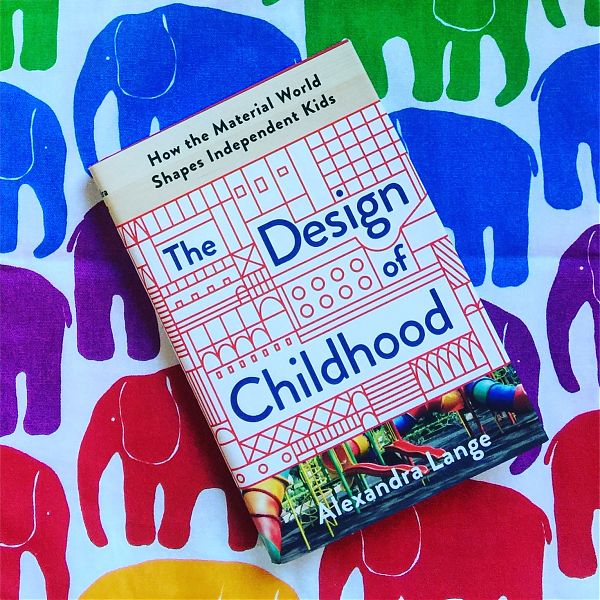
Today is publication day for The Design of Childhood: How the Material World Shapes Independent Kids and I am very pleased to have it out there in the world.
You can check for upcoming book events here. New York City and New Canaan so far, but stay tuned for some Rust Belt city appearances into the fall.
Buy it here or at your local independent bookstore.
Along with the pieces linked in previous posts, today brings more chances to sample the contents.
Architect published an excerpt from my chapter on Schools, focused on project-based learning environments.
The Houston Chronicle published this Q&A, How can we design the world for children?
Google Design produced this thorough podcast, which includes a great list of additional reading.
Yesterday Curbed published this Q&A with Kelsey Keith. Kelsey will be interviewing me tonight at McNally Jackson Books, 76 N 4th Street, Williamsburg. Join us if you can.
Century-Old Decisions That Impact Children Every Day
Illustration by LA Johnson/NPR.
Great story by Anya Kamenetz with amazing classroom history illustrations, plus a book excerpt on blocks, at NPR.
Alexandra Lange’s interest in school design started in her childhood, when she read Little House on the Prairie, with its indelible depiction of Laura’s one-room schoolhouse in Wisconsin.
Today, she’s an architecture and design critic. Her new book, The Design of Childhood, considers the physical spaces where our children learn and grow: from the living room rug crowded with toys, to the streets, welcoming or dangerous, to classrooms, bright and new or dilapidated.
“I felt like a lot of the contemporary discussion about education was really focused on content,” she tells NPR. “In that really tight space in front of the kid’s face. And as someone interested in design I’m always interested in, what kind of room are you in? How much natural light does it get? What kind of materials is it made of? What kind of a chair are you sitting in?”
The Magic of a Cardboard Box

Illustration by Derek Brahney.
On April 20, Nintendo released a new line of accessories for its best-selling Switch game console. Rather than being digital add-ons, they were physical ones: punch-and-fold parts engineered to turn the Switch console into a piano, a fishing rod or a robot. All are made of cardboard.
On March 4, Walmart ads shown during the Oscars centered on shipping boxes. The writer and director Dee Rees, nominated for “Mudbound,” created a 60-second ad in which the threat of bedtime gets incorporated into a sci-fi wonderland a little girl has imagined inside a blue cardboard box.
In June 2014, Google handed out kits for a low-cost virtual reality headset to be used with a smartphone. The headset was named Cardboard, for what it was mostly made of, and users assembled the units themselves.
In April 2012, “Caine’s Arcade,” an 11-minute short featuring a boy named Caine Monroy, was widely shared on the internet. Caine had spent his 2011 summer vacation building an arcade in the front of his father’s East Los Angeles auto-parts store out of the boxes the parts came in. He had the freedom to create an environment because cardboard comes cheap, and his father gave him space.
These 21st-century storytellers turned to cardboard for the same reasons that children have long preferred the box to the toy that came in it: cardboard is light and strong, easy to put up, quick to come down and, perhaps most important, inexpensive enough for experiment.
The Hidden Women of Architecture and Design

Kindergarten at the 1876 World's Fair in Philadelphia.
In the nineteen-fifties, the designers and developers of Detroit’s Lafayette Park believed that they had thought of everything to make city living as attractive as any suburb. A marquee architect from Chicago, Ludwig Mies van der Rohe, had created an array of housing options—rental and coöperative—in modernist slab towers, bars of attached town houses, and rows of low courtyard houses. The sharp-edged volumes were all bound together by landscaped greens and a large public park, romantically named the Plaisance, designed by Alfred Caldwell. The location was minutes from downtown. There was an adjacent shopping center. But, when the first “urban pioneers” began moving in, the ground had not yet been broken for the promised Chrysler Elementary School.
“This is a development designed to attract families,” Ruth Belew, a resident of the Pavilion apartments, told the Detroit Free Press. “If the children were forced to cross busy streets like Gratiot or Congress and Larned to get to existing schools, some parents would balk at moving in.” But until enough parents moved in, the school board wouldn’t release funds. The owners, to save their investments, had to think fast: they offered an unoccupied two-story town house to the Detroit Board of Education as a “one-room school,” and, on the recommendation of neighbors, hired Belew—a veteran of both the public-school system and the Red Cross service during the Second World War—to run it. Like a pioneer woman on the modernist frontier, Belew had to design what the architecture lacked: improvisation. With a summer to cram, she devised a course of study that would work for all sixteen pupils, using the city as classroom and calling on professional parents to fill in the curricular gaps. “I can’t sing, but we should be able to work something out,” she said.
Design and architecture have been, and remain, professions dominated by men. But when I set out to write my new book, “The Design of Childhood”—about the toys, playrooms, classrooms, and playgrounds that make up the worlds of children—I found a funny thing: women.
FLAIR: Bead Necklace

The fifth PROJECT:OBJECT volume is a 25-part series of true stories about significant accoutrements, appurtenances, and regalia
By rights, I’m a spring. In the 1980s we all got our colors done and my results were discouraging. Pink, light blue, Easter hues would be most flattering to my pale skin and light eyes. Small, gold jewelry and minimal patterns were recommended given my small scale. It all sounded very… pleasant. Who ever heard of a pleasant critic? Inside, I didn’t feel pastel or small or minimal. Inside, I feel loud. Beads, round, colorful, unmissable, flattered my personality.
With them I wear big prints, Marimekko when I can afford it, and the combination has become a kind of uniform. If I’m giving a talk, you can see me in the back. I’ve worn the same outfit both pregnant and not. I look like a paper doll, the graphic essence of myself, with a breastplate of beads. I am a character.
Young adult architecture
Hamilton Grange Library teenspace, by Rice+Lipka Architects. Photo by Michael Moran.
Public libraries offer teenagers space where no one tells them to sit up straight or be quiet
In 1978, South Kingston High librarian Linda Wood decided to remake a room at the Rhode Island school into something she called the Un-Commons: a furniture-less room with cushions on the floor, album covers mounted on the walls, 10 headphone jacks, and stacks of paperbacks, from science fiction and fantasy to mystery and romance.
Teens with a free period could choose a record, sign out headphones, and just chill out. The books didn’t even require a sign-out slip.
“The magic happens because there is hardly a teenager alive who isn’t ‘into’ music,” wrote Wood in the Wilson Library Bulletin. “While their parents shake their heads in disbelief, teenagers manage to read, study, write research papers, and do calculus, all to the beat of rock.”
Forty years later, Wood’s son Dan would have his chance to make an Un-Commons: a teen corner, tucked behind a bookshelf, at the back of the Kew Gardens Hills Library, in Queens, designed by his firm, WORKac, and opened in 2017. “The teen space was one of the reasons why they wanted to expand the library; it was the only new program they were adding,” he says.
Lessons from LA’s 1984 Summer Olympics
Opening ceremony at the 1984 Olympics in Los Angeles. Corbis/VCG via Getty Images.
The 1984 Olympics Games proved Los Angeles could do spectacle—on a shoestring budget. Can the city do it again in 2028?
The headline in the Los Angeles Times on October 18, 1980 read “L.A. Will Push For A Spartan Olympics,” stressing that the city’s bid would not include a new Olympic Village, but instead repurpose university dorms and facilities.
“We are invoking the spirit of Sparta,” said once and future Governor Jerry Brown. “There will be zero government money spent. Zero.” “That’s the guy we need,” said movie producer David Wolper of Peter Ueberroth, when he was a candidate for the presidency of the Los Angeles Olympic Organizing Committee (LAOOC) in 1978. “If anyone can run a Spartan Olympics, the cheap sonofabitch can!”
Spartan was the perfect word for what a non-Olympian might call economical, low-cost, or indeed, cheap. Denver backed out of the 1976 Games, which were picked up by Montreal, and cost 13 times the original estimate, leaving the city with $1.6 billion in debt. The Olympics had to be rebranded as an event that would not tax its host city or saddle it with overscaled stadiums. For the Olympics to have a future, LA had to stay frugal.
The Woman Who Gave the Macintosh a Smile
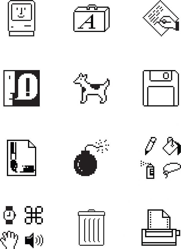
Courtesy Susan Kare.
Every fifteen minutes or so, as I wrote this story, I moved my cursor northward to click on the disk in the Microsoft Word toolbar that indicates “Save.” This is a superstitious move, as my computer automatically saves my work every ten minutes. But I learned to use a computer in the era before AutoSave, in the dark ages when remembering to save to a disk often stood between you and term-paper disaster. The persistence of that disk icon into the age of flash drives and cloud storage is a sign of its power. A disk means “Save.” Susan Kare designed a version of that disk, as part of the suite of icons that made the Macintosh revolutionary—a computer that you could communicate with in pictures.
Paola Antonelli, the senior curator of architecture and design at the Museum of Modern Art, was the first to physically show Kare’s original icon sketches, in the 2015 exhibit “This is for Everyone.” “If the Mac turned out to be such a revolutionary object––a pet instead of a home appliance, a spark for the imagination instead of a mere work tool––it is thanks to Susan’s fonts and icons, which gave it voice, personality, style, and even a sense of humor. Cherry bomb, anyone?” she joked, referring to the icon which greeted crashes in the original operating system. After working for Apple, Kare designed icons for Microsoft, Facebook, and, now, Pinterest, where she is a creative director. The mainstream presence of Pinterest, Instagram, Snapchat, emoji, and GIFS is a sign that the visual revolutionaries have won: online, we all communicate visually, piecing together sentences from tiny-icon languages.
The end of the architect profile

Illustration by Franziska Barczyk.
My first cover story was a profile of Richard Meier for Graphis Magazine. It was 1998 and the Getty Center was about to open. The magazine did not have the budget to send me to Los Angeles, but it had photos, so I was dispatched to Meier’s office on Manhattan’s west side to see what I could get out of the man in an hour.
Meier has recently been in the news as the first major architect to be publicly accused of sexual harassment by a cadre of former employees. He is taking a six-month leave from the approximately 50-person firm that bears his name. He didn’t sexually harass me; I was only patronized.
In the first (white) Meier monograph, John Hejduk quotes Herman Melville’s Moby-Dick on the meaning of Meier’s signature color, white: “… the thought of whiteness, when divorced from more kindly associations, and coupled with any object terrible in itself, [serves] to heighten that terror to the furthest bounds.”
On X
Follow @LangeAlexandraOn Instagram
Featured articles
CityLab
New York Times
New Angle: Voice
Getting Curious with Jonathan Van Ness