Are we having fun yet?
Kelly Sullivan/Getty Images for Museum of Ice Cream.
The sprinkles got to me first: After Boomerangs on banana swings, the second-most-popular ’gram from the Museum of Ice Cream seemed to be kid-buried-in-the-sprinkle-pit. When the museum premiered in New York in 2016, all the sprinkle pictures confused me, because who would want to eat something in which people had wallowed? The sprinkles aren’t edible, of course—they are plastic. (Duh.)
A recent profile of co-founder and creative director Maryellis Bunn helped me see what should have been obvious all along: The Museum of Ice Cream is not a museum, but a playground, albeit one with a seriously twisted idea of fun. The sprinkle pool is not Willy Wonka’s world of candy, but a giant sandbox.
All the pretty colors led me to dismiss it as just another millennial photo op, falling for what pioneering play theorist Brian Sutton-Smith called the “triviality barrier.” Children’s play in particular—and play, irrationality, and aesthetics in general—are so out of step with our work-oriented civilization that, he wrote in 1970, they have been seen as beneath the dignity of study. I was guilty of making the same mistake, but in fact, a little play theory helps us see the MOIC and its ilk, like Color Factory, for what they really are: working for the weekend.
The Track Pants I Copied From a World-Famous Architect
Outdoor Voices Stretch Crepe Track Pants, $85.
I would never have noticed if the world-famous architect had not raised her arm to point. On her upper half she wore a white blouse, black jacket, angular glasses. Below, a seemingly unremarkable pair of black trousers. But as she lifted her arm to trace a curve in the air I noticed the stitched insignia just below the pocket on her pants: a puma in white thread.
Was she wearing track pants?
As I scribbled notes about the building I took a closer look: matte finish, slightly tapered legs, ankle zips casually unzipped. Yes, they were track pants, worn not to work out at the gym or hunker down at home but on a day when she would be in front of an audience, traipsing up and down showing off her firm’s latest building.
That night, as I typed up my assessment of her tower (I found it to be a bit much), I simultaneously opened a tab and searched “puma track pants,” clicking through pages of seemingly identical offerings looking for the platonic version — her version. Too loose, they looked messy. Striped sides, too sporty. Too tight, they would resemble the dreaded yoga pants. I clicked and clicked but I couldn’t find them.
Eavesdropping on the design icons who made Washington’s Metro
A rush of train riders during morning commute at Metro Center station. The Washington Post/Getty Images.
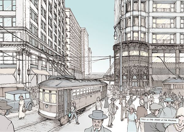
When the Unites States Congress set aside federal construction funds in 1965 for a new, underground transportation system for Washington D.C., President Lyndon B. Johnson decreed it “should be designed to set an example for the Nation, and to take its place among the most attractive in the world.”
“While we seek to resolve problems of moving people and goods within the congested National Capital area, our concerns must not be confined to the utilitarian requirements of transportation alone,” Johnson wrote to Walter J. McCarter, administrator of the National Capital Transportation Agency (NCTA, the forerunner of the Washington Metro Area Transit Authority (WMATA) on February 22, 1966.
At a time when public opinion of East Coast subways has reached a low, it is worth revisiting this high: a subway grand tour, CFA minutes with design advice from architect Gordon Bunshaft and art critic Aline Saarinen, rejected graphic designs that are the opposite of Unimark’s low-key Helvetica.
Have you hugged a geode today?
AMNH’s Hall of Gems after its 1976 opening. © AMNH Library 42499
The American Museum of Natural History announced this week the closing of its Hall of Gems on October 26. Designed by architect William F. Pederson in high 1970s style, these galleries are as close as you can get to lounging in a conversation pit in public in New York City. I am sad to see them go.
One of my first parenting memories of New York is being at the Museum of Natural History with my toddling son, and happening upon the soft darkness of the (as it’s officially named) Harry Frank Guggenheim Hall of Minerals and Morgan Memorial Gem Hall. Finally, a place to rest! With no hard corners and no other exits, I could park the stroller and let him wander on feet or knees at his will. Maybe he’d learn something from his explorations, maybe not. When you go to a museum with a 2-year-old, it’s as much for change of location as it is to foster a future scientist. He’d learn something from the geode just as he learned from the sandbox.
On repeat visits I figured out that this surrender to the visual and tactile was Pederson’s point: more engaging than the old-fashioned taxonomic case, less technological than today’s touchscreens, that era of exhibition design leaned in to the body as a teaching tool.
MoMA Makes A List of Iconic Fashion "Items"
Aran sweater interpreted by Catherine Losing. Courtesy of the Museum of Modern Art.
There are no Vogue covers at the entrance to the Museum of Modern Art’s first fashion exhibition since 1944. No mannequins, no ball gowns. “Items: Is Fashion Modern?” begins instead with a list and a slide show. The list calls out all hundred and eleven items in the show, chosen by the curators Paola Antonelli and Michelle Millar Fisher for their archetypal qualities. When Antonelli travelled to India and Bangladesh, for example, she asked people, “What is the stereotypical sari? The one that you think of when you close your eyes?” The slide show is a compendium of photos and images the curatorial team drew from social media, showing tracksuits, power suits, Union suits, and bathing suits in their natural settings, out there in our world. “The moment you see a list, you want to make your own,” Antonelli told me. “We want you to say, ‘This exhibition is about me.’ ”
She’s right. My list centers not on the objects of fantasy—Jane Birkin’s Birkin bag, red-soled Louboutin stilettos, Issey Miyake’s D.I.Y. A-POC dress—but on the Items that I have owned, most of which cost less than a hundred dollars.
The A-frame effect
No. 381 A-frame cabin, 1967. Denver Post/Getty Images.
Picture it: a triangular wall of windows and a sleeping loft; sliding glass doors out to a terrace; deck chairs, a barbecue grill, a picnic table, a dinner bell to call you in from the forest, the lake, or the beach.
With a braided rug on the floor and heart-shaped cutouts on the balcony balustrade, the house is all ready for a Sunset magazine close-up—until your child folds that terrace up, trapping the Play Family inside, lifting his Fisher-Price A-frame up by its convenient carrying handle. Getting home from vacation was never so easy.
This A-frame dollhouse looms large in the imagination of children of the 1970s. Manufactured only from 1974 to 1976, the house, described in the catalog as a “ski-chalet,” was the company’s first set to include bunk beds and a picnic table, the furniture avatars of a leisurely lifestyle, as well as one of the first to be entirely made of plastic, lightweight and low maintenance.
From its accessories to its portability, the toy A-frame closely resembles its full-size inspiration, a house that continues to serve as a symbol of an era when leisure—and second homes—was available to a much larger swath of the American population.
Cornell Tech's new NYC campus puts sustainable architecture into practice
The café at the Bloomberg Center. Matthew Carbone for Morphosis.
“How much does your house weigh?”
That was the question Buckminster Fuller used to ask in the 1920s when marketing his Dymaxion House, a 3,000-pound, circular, mass-producible, affordable, and environmentally-responsible house way ahead of its time. The line, later adapted for the title of a documentary about Norman Foster, a Fuller enthusiast, has become shorthand for a different kind of thinking—technological, industrial, radical—around architecture. Fuller turned his back on 150 tons of brick and right angles in favor of an evaluation method copped from the world of transportation.
I was reminded of this Fuller quote as I toured the three new buildings on Roosevelt Island, officially opening today, that make up the 12-acre campus of Cornell Tech. Those structures include the Morphosis-designed Emma and Georgina Bloomberg Center, an academic building named for the daughters of former Mayor Michael Bloomberg, whose philanthropy gave the applied sciences graduate school $100 million in 2015. The Bridge, designed by Weiss/Manfredi, is a seven-story “co-location” building intended to bring entrepreneurs to academia, and vice versa; while The House, by Handel Architects, is a 26-story, 350-unit dormitory for students, staff, and faculty that also happens to be the world’s largest Passive House building. (The fact that all three buildings are opening at the same time and on schedule gives me nostalgia for Bloomberg-era competence.)
On my tour, with the architects stacked back-to-back, a half hour per building, Michael Manfredi remarked that it felt a bit like a school science fair. At every turn, they spouted numbers:
40, 60, 1,465, 0
How should we live (at college)?
Masonry "gargoyle" on the corner of Ezra Stiles College by Eero Saarinen. G.E. Kidder Smith/Getty Images
Stand at the end of the walkway between Yale University’s two new residential colleges, and you will see what looks like an illustration for a bedtime story. Lines of lampposts and young trees soften the red brick and stone facades, punctuated by the occasional gable. At the far end, a Gothic bell tower, with four layers of round arches, reaches into the sky, while a street-level line of arched windows beckons you down the walk. The tower’s base is obscured by another building, making it look farther away than it really is, and creating an illusion that Yale might extend just as far in that direction.
It’s lively, it’s hierarchical, it’s picturesque. It could be the opening frame of any “college” movie. It could have been designed any time in the last 100 years. How you feel about that last statement will condition your reaction to Benjamin Franklin and Pauli Murray Colleges, fraternal twins housing almost 500 students each, on a 6.7-acre site just to the north of Grove Street Cemetery in New Haven.
But seriously, in 2017, will only neo-Gothic do? The walk, and the residential colleges flanking it, felt to me like a strenuous effort to sell Yale to an audience that was already in the bag.
A Graphic Novel to Transform Teens Into City Planners
Louis Sullivan's Carson Pirie Scott store in "No Small Plans," courtesy Chicago Architecture Foundation.
Chicago, 2211. The towers are taller. The apartments are smaller. The El has become the tube. Pho is the breakfast of choice. Communication happens mainly through screens, albeit floating holographic screens. Five teen-agers have been assigned to the City Planning Council for a year of public service. Their first assignment is to decide on the future of the Uptown Theatre, a white terra-cotta movie palace that seats four thousand and, in 2211 as in 2017, needs to be adapted into something new. (Regina Spektor filmed her “Black and White” video there.) After a tense meeting, three of them decide to go to see the theatre, and the Uptown neighborhood, for themselves.
“We really want a space to facemeet, instead of screening all the time,” one teen says. “I was wrong to think I could make a planning council decision from up in my apartment,” another says. Will Uptown get the server farm/performance venue it wants, or just more condos? Such is the cliffhanger ending of “No Small Plans,” a just-published graphic novel from the Chicago Architecture Foundation.
Gunnar Birkerts, postwar modernist, dies at 92
Gunnar Birkerts, Federal Reserve Bank (Minneapolis), 1976. Photo by Balthazar Korab.
“The School That Will Vanish,” reads the headline on Architectural Forum’s November 1967 story on Gunnar Birkerts’ Lincoln Elementary School in Columbus, Indiana. Birkerts had first worked in Columbus, that hotbed of postwar modernism, in the early 1950s, as project architect on Eero Saarinen & Associates’ Irwin Union Trust building.
Harry Weese, John Carl Warnecke, The Architects Collaborative and Edward Larrabee Barnes had all designed schools in the in the intervening decade but, unlike its six predecessors, Lincoln was set on an urban site, just down the street from Eliel Saarinen’s First Christian Church and the under-construction main library by I.M. Pei.
“They thought they didn’t need another star architect to build another one of those things,” Birkerts told me in an interview last year. “They thought they were losing part of the community. I had a good solution to that problem: first of all, the school occupies the smallest area that you could have, a square, and the rest returns to the town as a park.”
Birkerts died this week, at 92, but his work has never seemed more relevant.
On X
Follow @LangeAlexandraOn Instagram
Featured articles
CityLab
New York Times
New Angle: Voice
Getting Curious with Jonathan Van Ness