Eavesdropping on the design icons who made Washington’s Metro
A rush of train riders during morning commute at Metro Center station. The Washington Post/Getty Images.
When the Unites States Congress set aside federal construction funds in 1965 for a new, underground transportation system for Washington D.C., President Lyndon B. Johnson decreed it “should be designed to set an example for the Nation, and to take its place among the most attractive in the world.”
“While we seek to resolve problems of moving people and goods within the congested National Capital area, our concerns must not be confined to the utilitarian requirements of transportation alone,” Johnson wrote to Walter J. McCarter, administrator of the National Capital Transportation Agency (NCTA, the forerunner of the Washington Metro Area Transit Authority (WMATA) on February 22, 1966.
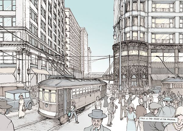
At a time when public opinion of East Coast subways has reached a low, it is worth revisiting this high: a subway grand tour, CFA minutes with design advice from architect Gordon Bunshaft and art critic Aline Saarinen, rejected graphic designs that are the opposite of Unimark’s low-key Helvetica.
Have you hugged a geode today?
AMNH’s Hall of Gems after its 1976 opening. © AMNH Library 42499
The American Museum of Natural History announced this week the closing of its Hall of Gems on October 26. Designed by architect William F. Pederson in high 1970s style, these galleries are as close as you can get to lounging in a conversation pit in public in New York City. I am sad to see them go.
One of my first parenting memories of New York is being at the Museum of Natural History with my toddling son, and happening upon the soft darkness of the (as it’s officially named) Harry Frank Guggenheim Hall of Minerals and Morgan Memorial Gem Hall. Finally, a place to rest! With no hard corners and no other exits, I could park the stroller and let him wander on feet or knees at his will. Maybe he’d learn something from his explorations, maybe not. When you go to a museum with a 2-year-old, it’s as much for change of location as it is to foster a future scientist. He’d learn something from the geode just as he learned from the sandbox.
On repeat visits I figured out that this surrender to the visual and tactile was Pederson’s point: more engaging than the old-fashioned taxonomic case, less technological than today’s touchscreens, that era of exhibition design leaned in to the body as a teaching tool.
MoMA Makes A List of Iconic Fashion "Items"
Aran sweater interpreted by Catherine Losing. Courtesy of the Museum of Modern Art.
There are no Vogue covers at the entrance to the Museum of Modern Art’s first fashion exhibition since 1944. No mannequins, no ball gowns. “Items: Is Fashion Modern?” begins instead with a list and a slide show. The list calls out all hundred and eleven items in the show, chosen by the curators Paola Antonelli and Michelle Millar Fisher for their archetypal qualities. When Antonelli travelled to India and Bangladesh, for example, she asked people, “What is the stereotypical sari? The one that you think of when you close your eyes?” The slide show is a compendium of photos and images the curatorial team drew from social media, showing tracksuits, power suits, Union suits, and bathing suits in their natural settings, out there in our world. “The moment you see a list, you want to make your own,” Antonelli told me. “We want you to say, ‘This exhibition is about me.’ ”
She’s right. My list centers not on the objects of fantasy—Jane Birkin’s Birkin bag, red-soled Louboutin stilettos, Issey Miyake’s D.I.Y. A-POC dress—but on the Items that I have owned, most of which cost less than a hundred dollars.
The A-frame effect
No. 381 A-frame cabin, 1967. Denver Post/Getty Images.
Picture it: a triangular wall of windows and a sleeping loft; sliding glass doors out to a terrace; deck chairs, a barbecue grill, a picnic table, a dinner bell to call you in from the forest, the lake, or the beach.
With a braided rug on the floor and heart-shaped cutouts on the balcony balustrade, the house is all ready for a Sunset magazine close-up—until your child folds that terrace up, trapping the Play Family inside, lifting his Fisher-Price A-frame up by its convenient carrying handle. Getting home from vacation was never so easy.
This A-frame dollhouse looms large in the imagination of children of the 1970s. Manufactured only from 1974 to 1976, the house, described in the catalog as a “ski-chalet,” was the company’s first set to include bunk beds and a picnic table, the furniture avatars of a leisurely lifestyle, as well as one of the first to be entirely made of plastic, lightweight and low maintenance.
From its accessories to its portability, the toy A-frame closely resembles its full-size inspiration, a house that continues to serve as a symbol of an era when leisure—and second homes—was available to a much larger swath of the American population.
Cornell Tech's new NYC campus puts sustainable architecture into practice
The café at the Bloomberg Center. Matthew Carbone for Morphosis.
“How much does your house weigh?”
That was the question Buckminster Fuller used to ask in the 1920s when marketing his Dymaxion House, a 3,000-pound, circular, mass-producible, affordable, and environmentally-responsible house way ahead of its time. The line, later adapted for the title of a documentary about Norman Foster, a Fuller enthusiast, has become shorthand for a different kind of thinking—technological, industrial, radical—around architecture. Fuller turned his back on 150 tons of brick and right angles in favor of an evaluation method copped from the world of transportation.
I was reminded of this Fuller quote as I toured the three new buildings on Roosevelt Island, officially opening today, that make up the 12-acre campus of Cornell Tech. Those structures include the Morphosis-designed Emma and Georgina Bloomberg Center, an academic building named for the daughters of former Mayor Michael Bloomberg, whose philanthropy gave the applied sciences graduate school $100 million in 2015. The Bridge, designed by Weiss/Manfredi, is a seven-story “co-location” building intended to bring entrepreneurs to academia, and vice versa; while The House, by Handel Architects, is a 26-story, 350-unit dormitory for students, staff, and faculty that also happens to be the world’s largest Passive House building. (The fact that all three buildings are opening at the same time and on schedule gives me nostalgia for Bloomberg-era competence.)
On my tour, with the architects stacked back-to-back, a half hour per building, Michael Manfredi remarked that it felt a bit like a school science fair. At every turn, they spouted numbers:
40, 60, 1,465, 0
How should we live (at college)?
Masonry "gargoyle" on the corner of Ezra Stiles College by Eero Saarinen. G.E. Kidder Smith/Getty Images
Stand at the end of the walkway between Yale University’s two new residential colleges, and you will see what looks like an illustration for a bedtime story. Lines of lampposts and young trees soften the red brick and stone facades, punctuated by the occasional gable. At the far end, a Gothic bell tower, with four layers of round arches, reaches into the sky, while a street-level line of arched windows beckons you down the walk. The tower’s base is obscured by another building, making it look farther away than it really is, and creating an illusion that Yale might extend just as far in that direction.
It’s lively, it’s hierarchical, it’s picturesque. It could be the opening frame of any “college” movie. It could have been designed any time in the last 100 years. How you feel about that last statement will condition your reaction to Benjamin Franklin and Pauli Murray Colleges, fraternal twins housing almost 500 students each, on a 6.7-acre site just to the north of Grove Street Cemetery in New Haven.
But seriously, in 2017, will only neo-Gothic do? The walk, and the residential colleges flanking it, felt to me like a strenuous effort to sell Yale to an audience that was already in the bag.
A Graphic Novel to Transform Teens Into City Planners
Louis Sullivan's Carson Pirie Scott store in "No Small Plans," courtesy Chicago Architecture Foundation.
Chicago, 2211. The towers are taller. The apartments are smaller. The El has become the tube. Pho is the breakfast of choice. Communication happens mainly through screens, albeit floating holographic screens. Five teen-agers have been assigned to the City Planning Council for a year of public service. Their first assignment is to decide on the future of the Uptown Theatre, a white terra-cotta movie palace that seats four thousand and, in 2211 as in 2017, needs to be adapted into something new. (Regina Spektor filmed her “Black and White” video there.) After a tense meeting, three of them decide to go to see the theatre, and the Uptown neighborhood, for themselves.
“We really want a space to facemeet, instead of screening all the time,” one teen says. “I was wrong to think I could make a planning council decision from up in my apartment,” another says. Will Uptown get the server farm/performance venue it wants, or just more condos? Such is the cliffhanger ending of “No Small Plans,” a just-published graphic novel from the Chicago Architecture Foundation.
Gunnar Birkerts, postwar modernist, dies at 92
Gunnar Birkerts, Federal Reserve Bank (Minneapolis), 1976. Photo by Balthazar Korab.
“The School That Will Vanish,” reads the headline on Architectural Forum’s November 1967 story on Gunnar Birkerts’ Lincoln Elementary School in Columbus, Indiana. Birkerts had first worked in Columbus, that hotbed of postwar modernism, in the early 1950s, as project architect on Eero Saarinen & Associates’ Irwin Union Trust building.
Harry Weese, John Carl Warnecke, The Architects Collaborative and Edward Larrabee Barnes had all designed schools in the in the intervening decade but, unlike its six predecessors, Lincoln was set on an urban site, just down the street from Eliel Saarinen’s First Christian Church and the under-construction main library by I.M. Pei.
“They thought they didn’t need another star architect to build another one of those things,” Birkerts told me in an interview last year. “They thought they were losing part of the community. I had a good solution to that problem: first of all, the school occupies the smallest area that you could have, a square, and the rest returns to the town as a park.”
Birkerts died this week, at 92, but his work has never seemed more relevant.
Memphis, Fiorucci and Me
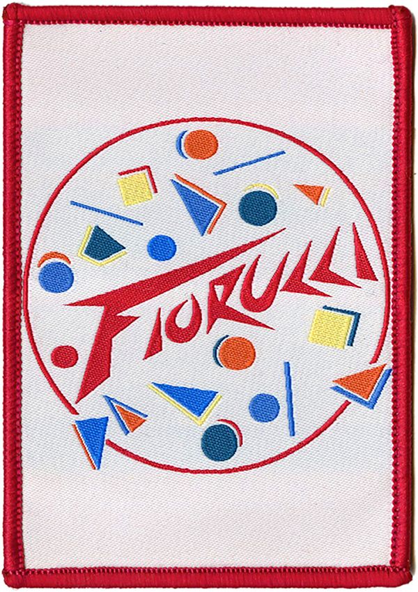
Fiorucci, 1984. Via It's Nice That.
This essay was originally published in the inaugural issue of August Journal as “Learning from Milan.”
In the eleventh grade, at a small Quaker school in Durham, North Carolina, I wrote a history paper about Memphis. Not the city some ten hours away, but the seven-year-old Italian design movement known for its subversive combination of plastic laminate, abstract pattern, and totemic shapes. The cover of my report was blue, and on it I attempted my own hand-lettered version of a jazzed Memphis typeface. Its contents have since been lost to history, as has my teacher’s reaction to the celebration of plastic, color and artificiality at a school where the wind whistled between the vertical siding and, when the wood stove proved inadequate, we just wore our coats inside. Style was not one of the virtues taught here—critical thinking was—and yet a previous generation of upper schoolers had included a boy who thought he was David Bowie, and one of my lunch companions dressed as if she were about to appear in a Guns N’ Roses video. We all rebel in our own way.
My rebellion wasn’t against my education but the place: a wood building in the woods, to which, now that I was 16, I drove with my younger brother in my Nissan Sentra each morning. I had once glimpsed another life, where there were coffee bars on every corner and a tram at the end of the street; where the very old and the very new brushed up against each other, and the stores were filled with rainbow sweaters. That life was in Milan.
I celebrated my 13th birthday with my family on January 7, 1986, our first night in Milan. It was dark and foggy, and I cried. My father was due for a semester-long sabbatical, and my mother had arranged the same, so here we were, for six months, in a vast foreign city whose outlines I couldn’t see. The following Monday my brother and I would start at Italian schools, where we wouldn’t understand a word. I was terrified.
At first, only the food helped. I loved the crown-shaped rolls, crisp around a giant air bubble, from the bakery around the corner. I savored the rotisserie chicken from the farmers market at the end of the block. I slowly learned the Italian varieties of pizza (Siciliana forever) and appreciated that I didn’t need to negotiate toppings with my brother. I gained the courage to order my own cups of cioccolata or orzata at cafés.
School was a mystery and thirteen-year-old girls a brick wall, but in all the time I had to daydream while the professoressa taught, I studied my new classmates. Their clothes were different. Popped collars. Sweaters of many hues. And they carried clear plastic pencil cases and the cutest satchels I had ever seen, with hard sides, a long strap, and a flap that buckled over the top. Each featured a different pattern of cloth, lacquered to a shine. Italian girls didn’t wear backpacks. They came to school with glamour.
My family went downtown on the tram to the biggest plaza I had ever seen, the icicle-like cathedral, the cathedral-like Galleria. Our block and our apartment were clean and orderly, but these spaces were grand and ancient—and there was a Fiorucci around the corner from the Duomo. I recognized at once that this was a place where the cool girls shopped. I remember the shopping bag better than its contents. Made with clear, thick plastic, and adorned with a pair of cherubs, it should have been tacky but it was a treasure.
Benetton was there, too. Their ads were everywhere that year, but the stores, bright and white with stacks of sweaters running up the wall, like Technicolor lanterns lighting up the gray stone storefronts, stopped you dead in your tracks. It was hard to even move past the door without falling for a color. I finally settled on turquoise, but not without casting backward glances at cranberry and jade.
Spring progressed, and I never made any friends. My brother, who was 9, learned the few phrases required to play calcio and used that as his entrée—there were always boys kicking a ball around somewhere. But I made friends with the city. At a certain point, I could walk around the neighborhood by myself, order pastries at the bakery, finger the pens at the stationery store. Later, I would even ride the tram downtown alone to the Duomo to meet relatives visiting from out of town, proud that I knew my way around the monument. Milan became familiar, a home.
The bags were another story. They were from a company called Naj-Oleari, quite expensive, and available in a bewildering array of patterns and sizes, from Liberty-esque florals to stripes that looked dull in context. After much negotiation with my mother, I acquired one just in time for me to take it home to Durham. It was pearly gray, with a geometric scatter of tiny pastel cars. The color said sophisticated, the automobiles said kid. I didn’t know what I was yet—I may not have known until I was 30—but I loved that bag.
I didn’t know about Memphis, officially, while I was in Milan. My mother bought Barbara Radice’s book that year, and we could have seen a show, though we didn’t have the connections to go to the furniture fair. But I saw where it came from. Memphis, albeit for grown-ups, wasn’t that far from the Fiorucci cherubs, the candy colored sweaters, and the cheeky printed plastic bags that were part of 1980s Italian teen culture. My Milanese treasures, and the experience of seeking them out, had made me susceptible to its charms. The plastic aesthetic flourished in that old gray city, much in the way kawaii culture flourishes in new high-rise Tokyo. Cheeky taste refreshes the immovable and immutable. As founding member Ettore Sottsass told the Chicago Tribune in 1986, “Memphis is like a very strong drug. You cannot take too much. I don’t think you should put only Memphis around. It’s like eating only cake.”
Three years later and back in Durham, I wrote about Memphis because it seemed the farthest thing from where I was, a young city of wood and brick and asphalt, and an ongoing connection to where I wanted to be. I knew I wanted to live in a city, a real city, where the buildings were stuck together and I never needed to drive a car. I carried my coveted satchel, used my clear pencil case, and wore my candy-colored sweater until it was ragged. Sottsass’s Carlton bookcase, then as now my favorite Memphis piece, was not merely an object of fascination. It was a portal to the future me.
Hippie Modernism, Italian Style: Ettore Sottsass at 100
Ettore Sottsass, 1974. © Photo Bruno Gecchelin, 1974 by SIAE 2017.
How do you make Ettore Sottsass’s bed?
That was the question facing curator Christian Larsen, who placed Sottsass’s 1992 couch, with a scrolling pearwood footboard and a headboard textured like a high block wall, at the end of the new Met Breuer retrospective of the Italian architect’s work, “Ettore Sottsass: Design Radical.” Should he play up the fairytale aspect of sleeping in a castle with a white fur counterpane? Or go with something more monkish?
In the end, the answer became clear: you make it “very plainly.” White sheets and a single pillow. The ascetic as king.
The question of bedclothes is not trivial to understanding the work of Sottsass, who would have been 100 this year (he died a decade ago, in 2007). Best known as the ringleader of Memphis, the short-lived and wildly patterned design collective that defines 1980s style, Sottsass was perpetually tweaking the nose of modernism while embracing its machines, its manufacturers, and even its colors.
On X
Follow @LangeAlexandraOn Instagram
Featured articles
CityLab
New York Times
New Angle: Voice
Getting Curious with Jonathan Van Ness