Portfolio | Miller House
For more information on this, one of the loveliest and most colorful modern American homes, I’m going to link to the Design Observer post I wrote on the occasion of the opening of the J. Irwin and Xenia Miller House to the public in 2011.
For many American architects, their first commission is a house. Even if they go on to fame and fortune and skyscrapers, what people think of first, when they hear the name, is that house. Eero Saarinen grew up in two houses designed by his father Eliel, first Hvittrask (1901-03) in Finland, then the Saarinen House (1928-30) at Cranbrook. The Saarinen House became, like the Cranbrook and Kingswood school buildings, a family project. Mother Loja Saarinen created fabrics and rugs and collaborated on the garden. Eero designed furniture for his parents’ bedroom. Sister Pipsan designed motifs for the family’s bedroom doors. Eero himself has never been identified with a house. But that might be about to change.
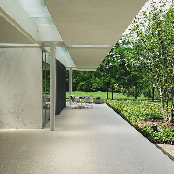
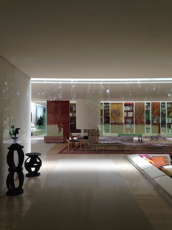
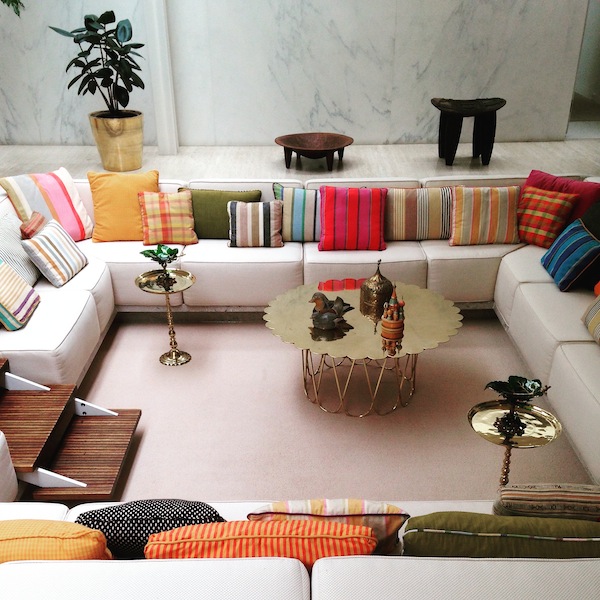
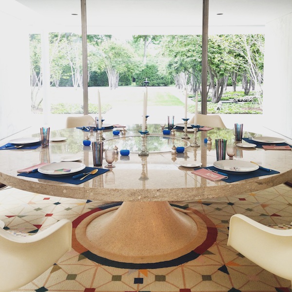
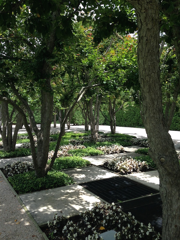
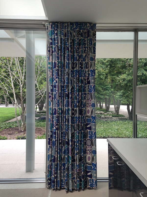
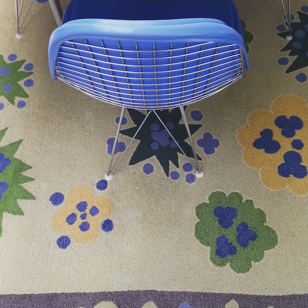
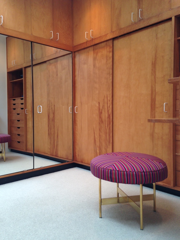
On May 10, the J. Irwin and Xenia Miller House in Columbus, IN opens to the public for the first time since it was completed in 1958 (Video here). Designed by Saarinen and Kevin Roche, with interiors by Alexander Girard and gardens by Daniel Urban Kiley, the Miller House has been largely out of sight to the design world since its single publication in House & Garden in 1959. Xenia Miller lived there until her death in 2008, so what will be on display is the house as lived in and impeccably maintained by the Millers and their caretakers, a father and his son. Curators at the Indianapolis Museum of Art have cleaned, repaired and replaced, but dedicated themselves to working with what the Millers had left there, rather than trying to return it to 1958. Adding the Miller House to the list of iconic American modern houses suggests some new ideas about Saarinen and his collaborators, but also about for whom modern houses are designed. That Saarinen’s first homes were family affairs turns out not to be just a footnote.
More here.


Book: 30 Years of Emerging Voices
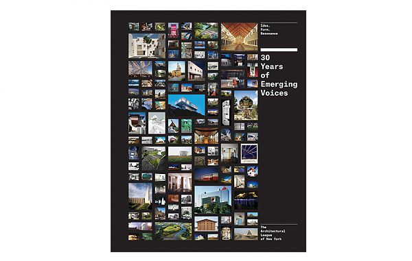
Princeton Architectural Press has just published 30 Years of Emerging Voices a beefy, thoroughly illustrated compilation of the work of three decades of winners of the Architectural League of New York’s early- to mid-career award. Karrie Jacobs wrote a nice assessment of what can be gleaned from the volume in Architect:
Revisiting three decades of winners as a continuum is revealing about what architecture truly is: not the province of a few celebrated practitioners, but an ongoing process of invention and reinvention by a multitude of talented and thoughtful firms.
I was pleased to be asked to contribute a text to the book about the winners of the mid-2000s. I took as my theme the rise of partnership. I’ve posted it in full below.
The biggest architecture story of 2013 was an insult from 1991. When Robert Venturi won the Pritzker Prize that year the jury citation mentioned his partner and wife Denise Scott Brown in the fifth paragraph. Asked about the Pritzker by the Architects’ Journal in March 2013, Scott Brown said, “They owe me not a Pritzker Prize but a Pritzker inclusion ceremony. Let’s salute the notion of joint creativity.” It is important for Scott Brown to be recognized because she deserves it. But the second part of her quote is more meaningful for the future of the field.
More than making a place for women, Scott Brown’s emphasis on “joint creativity” means making a place for partners. Looking at the Emerging Voices across the decades reveals a program that has changed in order to reflect new definitions of both “architecture” and “practice.” These new definitions make the Pritzker, still fighting the idea of admitting a wrong, seem fundamentally out-of-date, despite the fact that it has honored two partnerships (Herzog & de Meuron in 2001 and SANAA in 2010). Even the AIA has (belatedly) recognized the importance of partnerships, voting in new rules for the Gold Medal that allow it to be awarded to pairs as of 2014.
Starting in the late 1990s, the ratio of individuals to partnerships in the Emerging Voices program slowly began to change. The period from 2004 to 2008 is, if not a watershed, clear evidence of that shift. In 2004, John Friedman and Alice Kimm were the only partners honored. A year later, more than half the winners were firms with two or more principals. In 2006, half of the winners were partnerships. By 2007, partnerships, including brothers Peter Anderson and Mark Anderson, outnumbered individuals. And in 2008, nearly all the selected firms were led by multiple voices, including the five-person partnership of El Dorado, the four-person Onion Flats (three brothers among them), and siblings Granger Moorhead and Robert Moorhead.
The rise of partnerships is an acknowledgment that one person isn’t doing it all. One person can’t do it all. Togetherness may be the only way to have it all. Partners have different but equal talents. Partners cover for each other during life events (births, deaths, illnesses). Partners write and partners design. Partners set up the plumbing inspection and partners manipulate the 3D model. And sometimes partners stay home two days a week to take care of the kids.
The future of a sustainable, inclusive, and creative architectural profession also requires expanding the definition of “architecture practice.” Freecell (EV05), Lead Pencil Studio (EV06), and Höweler + Yoon Architecture/MY Studio (EV07) sustain themselves through both conventional and alternative projects, including installations. The “and” in many-handed firms means different skills, not all learned in architecture school: design and construction for Bercy Chen Studio (EV06) and design and development for then-partnership Della Valle Bernheimer (EV07).
The makeup of Emerging Voices in the mid-aughts reflects reality. My own jury experience, in 2011, involved no predetermined agenda to select firms helmed by multiple principals, yet there were no sole practitioners among the winners. I sifted through the portfolios, waiting to be drawn into the work. I never counted the names on the title page.
It is as important to recognize Denise Scott Brown’s role in what remains Robert Venturi’s Pritzker as it is to acknowledge that a single person is no longer expected to have all the talent or shoulder all the responsibility. To succeed, one shouldn’t have to do everything. Putting two, or three, or four, or five names on the door makes a tremendous difference, and diminishes no one.
Spotting Real-World Architecture in Monument Valley

L: Screenshot from Monument Valley, via UsTwo. R: La Muralla Roja housing project by Ricardo Bofill, via ArchDaily.
Minimalism in architecture means smooth surfaces, a limited color and materials palette, a refusal to clutter or adorn. Minimalism builds the should-nots into its structure—if you need to #Konmari afterward, you’re not listening—setting out a lifestyle that may be difficult but should reward you with a living space of monochrome dishware, right-angled benches, and columns of natural light. It may result in a building that looks of another world, absent the irrationality (and dirt) of what we commonly refer to as real life.
Minimalism in game-making shares many of the same qualities, at least according to Neil McFarland, Director of Games at UsTwo, makers of Monument Valley, the addictive spatial puzzle-solving app that’s clocked four million downloads and counting. “There is very little in the levels that is superfluous. There are no achievements in the game, no unlockables, no secrets. We really wanted it to be just about the experience of traveling through those monuments and nothing else.”
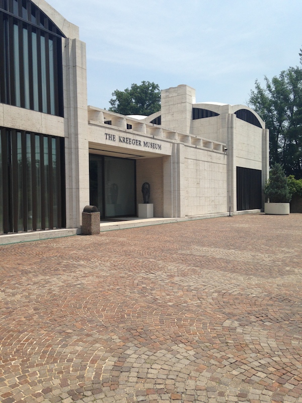
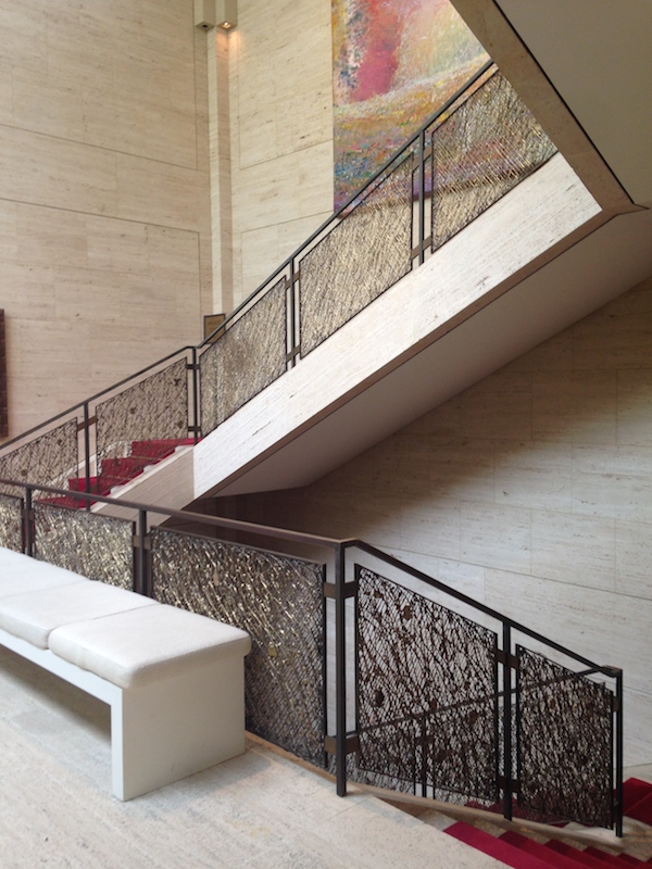
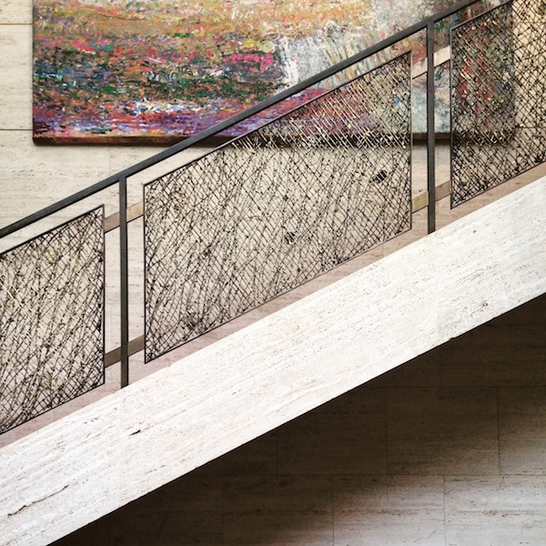
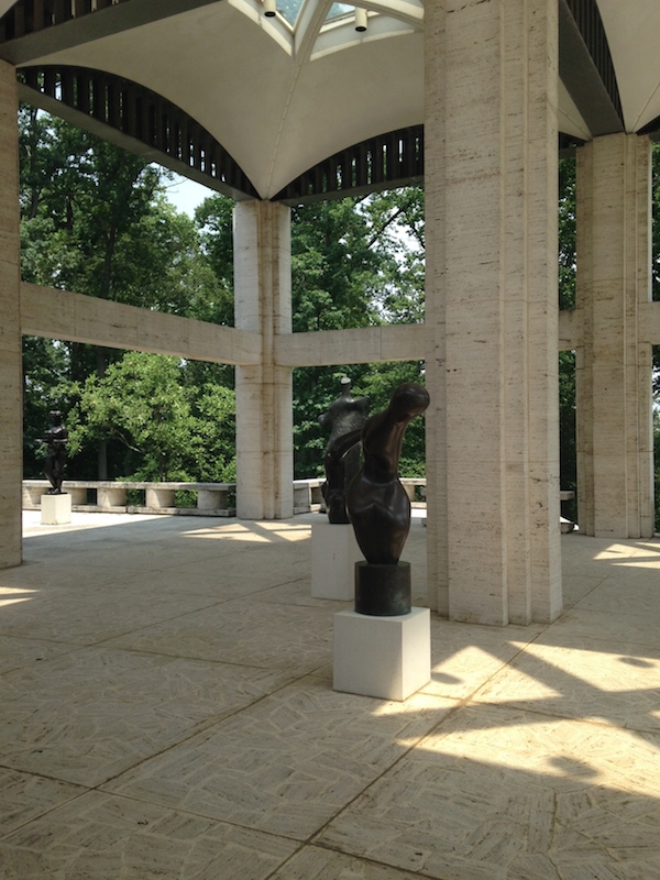
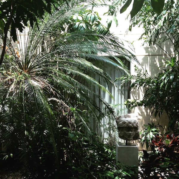
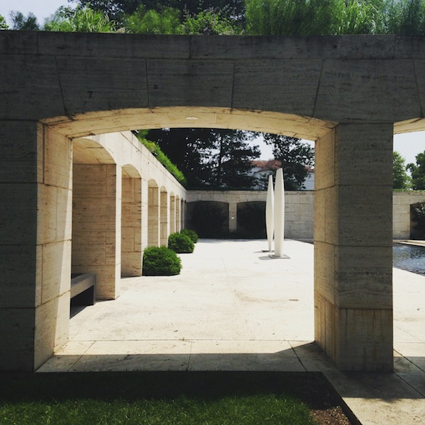
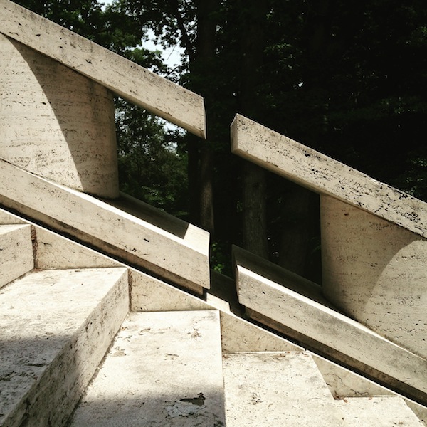
Portfolio | Kreeger Museum
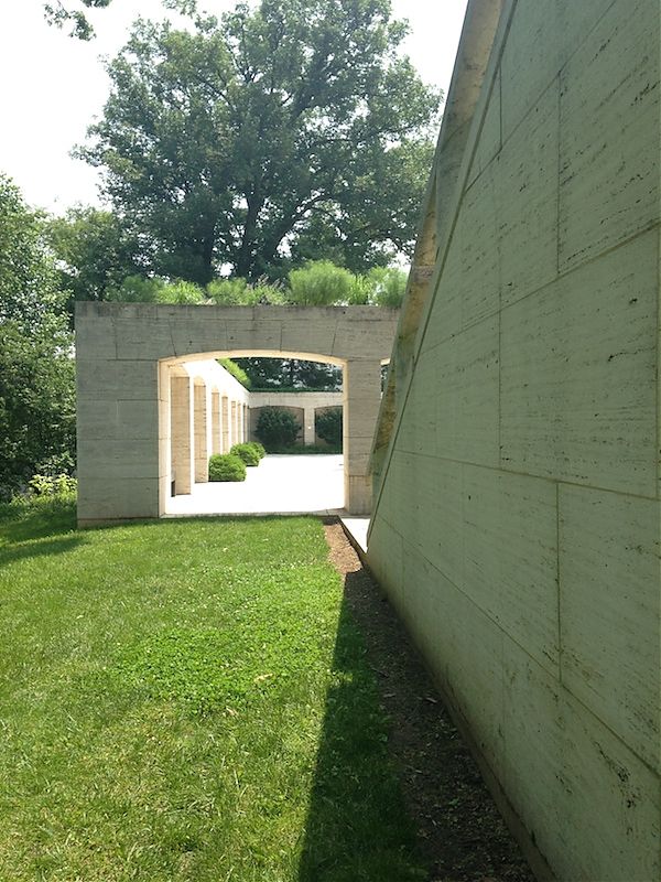
The Kreeger Museum, located in NW Washington, DC, was designed by Philip Johnson in 1963 as a private home for art collectors David and Carmen Kreeger. After the Kreegers’ deaths, the house became a public museum, showcasing the couple’s collection of postwar art and sculpture. As a building it reads somewhere between a public and a private space. The scale is grand and many details are reminiscent of Lincoln Center, designed at the same time. The beautiful cast bronze railings in the stair hall were designed by Edward Meshekoff, similar (if not identical) to his railings at Johnson’s New York State Theater. On the other hand, the intimate, jungly courtyard and the pink-carpeted art walls recall domestic spaces Johnson designed for the Menils in Houston and he and David Whitney in New Canaan. The most surprising moments are found around the back, where the pool and patio suddenly take on the grand, ancient scale of the Fascist architecture of EUR. I visited on a weekday (when you have to make an appointment) and the experience felt — pleasantly — like snooping on the lives of rich art collectors.

Maker culture has infiltrated Hollywood—but where are the girls?
Never gets to make a jetpack. (Courtesy Disney)
Brad Bird’s new film Tomorrowland is the latest in a string of kids movies with a message about making. In the movie, Frank Walker creates a jetpack out of a vacuum cleaner, and brings it to the 1964 World’s Fair. Asked what purpose it serves, he says it is for fun, a product by and for dreamers and not (spoiler alert) for the dystopia that the movie’s United States will become.
The garage-inventor mythos that still fuels Silicon Valley becomes in Tomorrowland a battle between the haves and have-nots of imagination, with Albert Einstein (in the form of a Pinterest-style inspirational quote) on hand as patron saint. Frank’s ostensible protégée is, unusually, a girl, the gender-neutrally named Casey who asks (of the planet) “Can we fix it?”
But then she doesn’t get to make a jetpack. She only gets to admire.
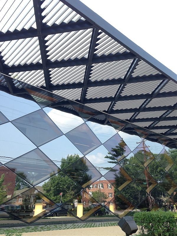
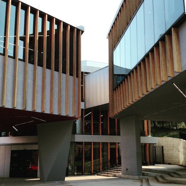
Portfolio | David Adjaye's DC Libraries
As part of my two-day modern architecture tour of DC last week (images of Philip Johnson’s Kreeger Museum and other landmarks to come) I visited David Adjaye’s two community libraries, both completed in 2012. I hope to review Adjaye’s Sugar Hill housing complex in Harlem when its museum component is complete this fall, as well as Freelon Adjaye Bond/SmithGroup’s National Museum of African-American History and Culture, in 2016. I wanted more context. After seeing both I would recommend the trip with one caveat: while it is possible to get to both libraries via public transportation, getting to both in an afternoon was time-consuming, and much easier to do in a car. For background, I point you to Philip Kennicott’s 2012 review of both with which I am (mostly) in agreement.
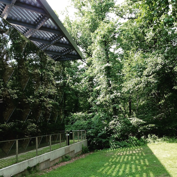
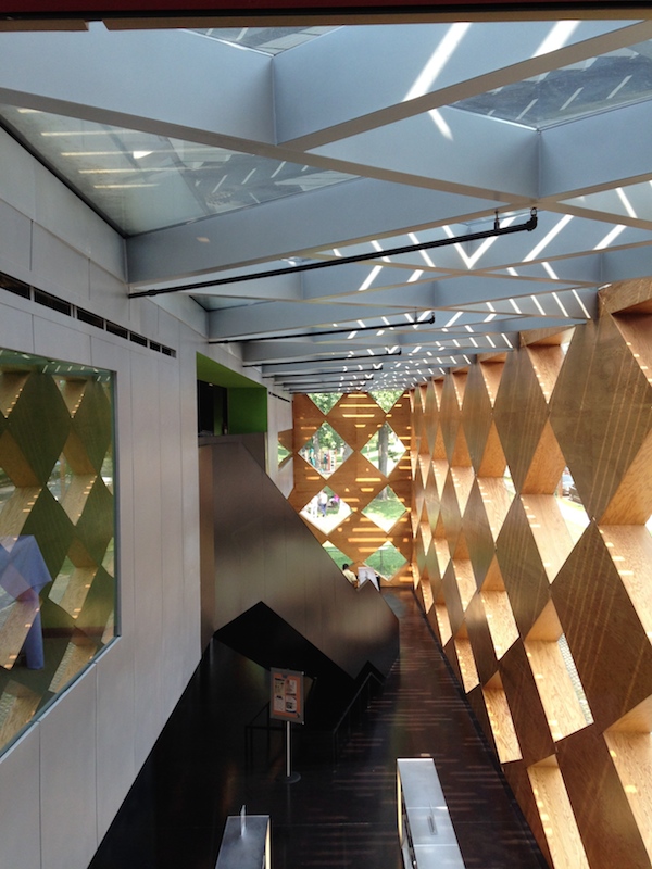
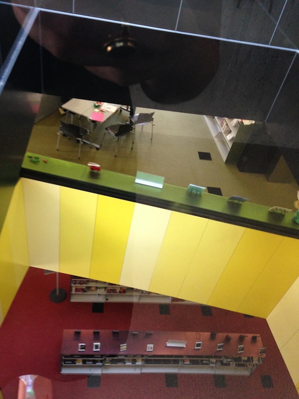
First I visited the Francis A. Gregory Library, located about a mile from the Naylor Road Metro stop in a modest, green residential neighborhood. Traveling up the street toward the library one has the illusion, for a moment, of a building that isn’t there. The library’s faceted exterior, made of tinted and reflective glass diamonds, fades into the trees of the forest behind it so that the plain brown box that marks the entry can look like it is fronting nothing.
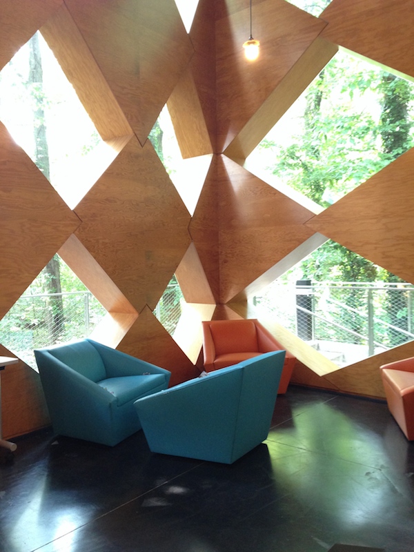
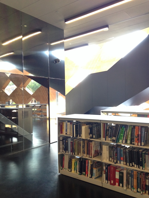
The Gregory Library has the simpler idea, beautifully executed. In plan it is a long box, tucked under a gridded roof that continues the diamond motif. Inside, stacks and reading areas reach from wall to wall, and the inside of the diamonds are faced in blonde plywood, crude but effective. It feels like being inside a sculpture; you are dwarfed by the scale of the diamond openings but not made to feel insignificant. As you move toward the back the diamonds all show the green of the trees, and you get the sense of moving into the forest. The upper floor, a box within the box containing the children’s areas and community rooms, is reached up a dark, diagonally-placed staircase. It is colorful and busy up there, including little reading nooks with green cushions. I only wished these had also reflected the diamond motif. The service areas on both levels were coated in a reflective plastic, effective at breaking up their bulk and bouncing more sunlit diamonds around the room. In a few corners the plan did start to feel cluttered — like where an oval-shaped quiet workspace, faced in angled glass, was stuck between the core and the wall. It felt like a good idea shoehorned in after the footprint had shrunk, and should perhaps have been saved for another project.
Break here for a walk plus Metro plus bus to the Bellevue Library, south of the Anacostia Metro stop.
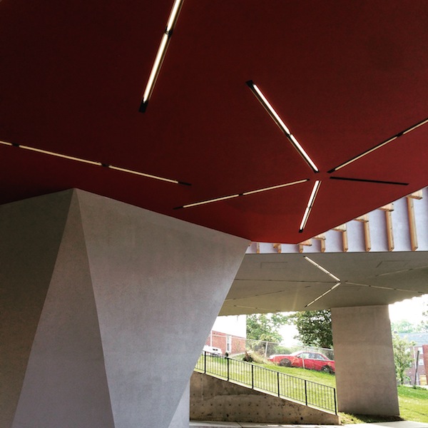
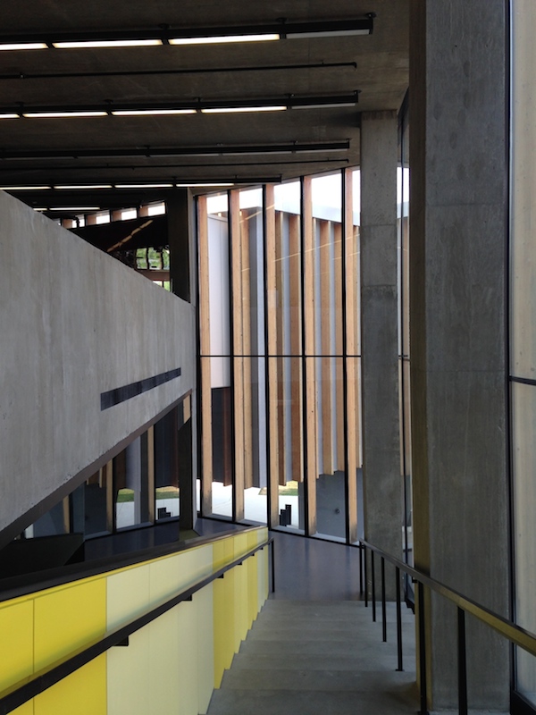
It’s quite a surprise to move from the Gregory to the Bellevue Library; as Kennicott notes, you would no know they were by the same architect. Bellevue is set on a primarily paved site, its bulk raised on concrete stilts. The exterior is gray concrete with wooden slats running up and down over the concrete and the large wraparound windows. I thought the combination of wood and concrete was odd. The wood felt residual, like an older, more expensive woven covering had been value-engineered down to Home Depot lumber. Some of the stilts are shaped in an obvious Breuer homage, others were basic rectangles (why?). The terraced ground also seemed like a Brutalist reference, perhaps to Paul Rudolph’s shaped surfaces, but I wondered how often it was occupied. There, and around the back where desks have a view of a lattice bare of ivy, it seemed like some landscaping had yet to be paid for.
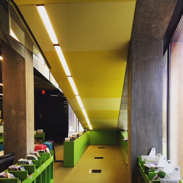
The Bellevue Library, like Gregory, seemed well-used and well-loved. The top floor, with its differently-shaped daylit spaces for reading and typing was elegant and serviceable, reached up a graceful stair highlighted by a yellow railing. But the first floor was cramped, with no place to sit, and the children’s spaces were choppy and incoherent except for the bright reading nook under the stair. I wondered again if, in his desire to make reflective shapes and cuts indoors, Adjaye hadn’t undermined some basic plan functions. The starburst tube lighting repeated on the exterior and the interior was a nice use of a simple material, as were the many hits of color throughout. If you go, be sure to visit the ground-floor bathrooms, and look up.
A Tour of Brooklyn's Best Vintage Typography

Bright and early yesterday morning, 30-plus dedicated typophiles, many in town for the 10-day Typographics design festival, followed Alexander Tochilovsky through brownstone and industrial Brooklyn looking up, down and across for examples of lettering on manhole covers, coal chutes, former pharmacies, apartment buildings, and churches. Tochilovsky, an adjunct professor at the Cooper Union and the curator of the Herb Lubalin Study Center of Design and Typography, was equally happy pointing out naive sign-painting and errors in computer typesetting, as well as the past mastery of utility companies’ metalwork. The tour ended at the 1891 Boys High School on Marcy Avenue, designed by James W. Naughton and featuring lots of beautiful brownstone lettering.
A Moat? A Ditch? How To Secure The White House Grounds
How do you design a White House fence to keep out intruders, without making the president’s front lawn feel like a prison yard? Architecture critic Alexandra Lange tells NPR’s Scott Simon.
Does the Hirshhorn Have Windows? The Museum Debates the New York Times
In a story posted Thursday at Washington City Paper Christina Cauterucci collects the Hirshhorn’s artful response to the question of whether the museum does have windows or not.
In an October 2014 profile of Melissa Chiu, the then-new director of the Hirshhorn Museum and Sculpture Garden, the New York Times made a wobbly claim. Paraphrasing Chiu, Times staffer Graham Bowley wrote that “the shows that work best in the Hirshhorn are those that embrace the distinctive curved spaces of its round, nearly windowless building.”
Windowless, eh? Not so fast. The interior ring of the Hirshhorn is almost entirely made of glass, bathing the circular corridors in natural light, and the Lerner Room, lined in colorful Sol LeWitt wall drawings, offers a magnificent panoramic view of the Mall. At the time of the October article, architecture writer Alexandra Lange wrote the Times to request a correction. The editors wouldn’t budge. Yesterday morning, Lange reupped her complaint.
More Buildings to Hate
Vintage interior photo of Boston City Hall, photographer unknown.
Last week T Magazine published my interviews with seven top architects defending what the magazine called The World’s Most Hated Buildings. Naturally, the people of the internet could think of many more that did not make Zaha Hadid, Norman Foster, Daniel Libeskind and company’s list.
At Gizmodo, Alissa Walker revealed her own love for John Portman’s anti-urban Bonaventure Hotel in downtown Los Angeles, and asked readers to write in with more nominees. Leading candidates: Robarts Library in Toronto, Experience Music Project in Seattle and of course top Twitter nominee Boston City Hall.
At Curbed, they’ve got the Portland Building (about which I wrote a very narrow defense last fall), the recent Walkie Talkie Tower in London, and the Antilla — the 34-story private residence in Mumbai.
On X
Follow @LangeAlexandraOn Instagram
Featured articles
CityLab
New York Times
New Angle: Voice
Getting Curious with Jonathan Van Ness