The Calligraphy Stars of Instagram
What can you make in fifteen seconds? You can’t knit a hat or sew a dress. You can’t cook a meal or bake a cake. You can’t 3-D print a thingamabob or build your IKEA hack. But you can write a word. And a word, written in black letter, uncial, Copperplate Script, Roman capitals, or even the “Star Wars” font by a professional, has all the virtues of those far more complicated handmade things. With an Instagram video, you can spend fifteen seconds watching something exceptional being made before your eyes.
The artist and designer Seb Lester (@seblester) is the resident celebrity of Instagram calligraphy, with a half million followers, and another half million across other social-media platforms. “So much of calligraphy is about movement and rhythm, and a short video can capture the beauty and the magic of calligraphy in a very Internet-friendly format,” he said. “Recurring words in people’s comments are ‘mesmerizing,’ ‘hypnotic,’ and ‘satisfying.’ For reasons I don’t fully understand, people clearly enjoy watching the process of something perceived as ‘perfect’ being made from start to finish.” Two weeks ago, Lester posted an Instagram video of him lettering the word “mesmerize” with two pencils in one hand and flourishes above and below. It now has more than eighteen thousand likes.
Seven Leading Architects Defend the World's Most Hated Buildings
Tour Montparnasse, Paris, chosen by Daniel Libeskind. Photo by Luc Boegly/Artedia, via View.
Can the field’s top minds change the way we think about a doomed housing project in Naples or the most abhorred skyscraper in Paris? Allow them to try.
For T Magazine’s Beauty issue, I interviewed Daniel Libeskind, Zaha Hadid, Annabelle Selldorf, LO-TEK, Norman Foster, Amanda Levete, and Vincent Van Duysen about their favorite Ugly buildings.
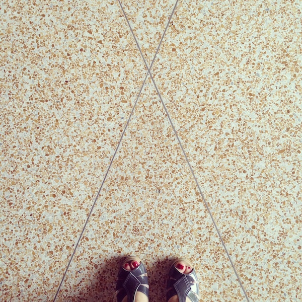
Instagram Archi-tourism

Instagram hashtag search for #MITchapel
From May 28 to May 30, the Walker Art Center in Minneapolis will host the symposium Superscript: Arts Journalism and Criticism in the Digital Age. Since I could not participate in person, the organizers asked me to contribute to the Superscript Reader, an online adjunct to the talks (which will all be livestreamed) at the symposium.
When I’m invited somewhere new, the first thing I do is go to Google and type in “[city name] modern architecture.” Mexico City, San Francisco, Sarasota. It’s a way to structure my time and a quick aide-memoire. Some cities I don’t even have to Google. Mention Detroit and I’ll say generalmotorstechnicalcentercranbrookmiesatlafayetteparkandthatprettyyamasakiatwaynestate.
Portland? Halprinopenspacesequencethemichaelgravesportlandbuildingisrightnextdoor. The drive to Alvar Aalto’s Mount Angel Library is worth it, I might add.
Boston?
Saarinenchapelatmitgropiushousecarpentercenterandofcoursepaulrudolphatgovernmentcenter. Pause for breath. Brandeis has a great postwar architecture collection also.
From my vantage point in Brooklyn I visualize the map of the United States not as foreshortened, as in the great Saul Steinberg New Yorker cover, a poster of which hung in my childhood breakfast nook, but as a dark space filled with twinkling lights. Some of those lights are big cities like Chicago and Los Angeles, but many of them are stars only of the slide room in which, in college, I used to file images from art history lectures. Bartlesville. Eureka Springs. Moline. In many cases I learned to put them in alphabetical order before I’d seen the pictures on the screen. These were and are the all-star towns in the modern architecture firmament, still absent from the typical tourist map. We have the tools to make our own maps now, but they haven’t yet reached the design heights of the subject matter.
Never-Loved Buildings Rarely Stand a Chance

Stairwell, Cambridge, 2013 © Lee Dykxhoorn
It’s a detail too perfect, better suited to a novel. Architecture critic goes to kindergarten at modernist school. Years later, she returns to the city of her birth and discovers the school again, surrounded by construction hoardings, on the brink of destruction. Can she save it? Except that was me, and I was too late.
My school, Martin Luther King Jr. Elementary School in Cambridge, Massachusetts, was designed by the firm of Josep Lluís Sert: Spanish architect and planner, former Harvard Graduate School of Design dean, designer of the superb Peabody Terrace apartments just across the street, as well as buildings for Harvard and Boston University. My school came late in his career, late for the concrete walls and rhythmic geometric shadows that were signatures of his architecture, and late, too, for the architecture’s relationship with the surrounding stick-built residential neighborhood known as Riverside. My school was demolished during the spring of 2014. Another King School is now under construction, this one of terminal beige exterior blandness, designed by Perkins Eastman. King School 2.0 trumpets its community connections, zones for students of different ages and natural lighting—just like the one it will replace.
"Women were unwelcome in architecture, but male architects couldn't live without them"

Leonore Tawney at her loom (Courtesy MAD Museum)
The journalists, artists and curators at the press preview for the Museum of Arts and Design’s new exhibition, Pathmakers: Women in Art, Craft and Design, Mid-century and Today, were about 90 per cent female – an unusually high percentage, according to the museum’s publicist.
But the imbalance seemed about right, in that it reflected the continuing, uneasy, and gendered relationship between people who make things out of yarn, clay or cloth and people who make things out of glass, steel or plastic. The editors of a few blogs seemed unsure whether the contents of the show – four hanging woven-wire sculptures by Ruth Asawa, screen-printed geometric textile designs by Anni Albers, a test panel for the gold-embroidered tapestries for the Ford Foundation by Sheila Hicks, along with work by 39 other artists – even counted as “design” for their purposes.
“In the 1950s and 1960s, an era when painting, sculpture and architecture were dominated by men, women had extensive impact in alternative materials such as textiles, ceramics and metals,” reads the wall text.
MoMA does Latin American architecture
A late 1950s church by Eladio Dieste in Uruguay (Leonardo Finotti / MoMA)
Carolina Miranda, who writes a terrific and wide-ranging culture blog for the Los Angeles Times with recent posts on Chilean modern and contemporary architecture, invited me for an email chat on “Latin America in Construction.”
“Latin America in Construction: Architecture 1955-80” looks at a quarter-century of Modernist architecture on the continent, from experimental housing projects on the outskirts of Lima, Peru, to the epic undertaking that was the design and construction of Brasilia, which emerged from the savanna like a Modernist sci-fi mirage. There are thought experiments (poetic architecture, anyone?), historic models, park design, affordable housing developments, vintage construction photos and schematics for buildings that are all about color.
Needless to say, there is a lot to see. Which is why rather than tackling this on my own, I invited architecture critic Alexandra Lange to chat with me about the show. Lange writes for the New Yorker and the New York Times and recently joined Curbed, where she is doing some awesome stuff. Better yet, she recently reviewed “Latin America in Construction” for Architect magazine.
Carolina Miranda: This is a dense show, with more than 500 objects, including models, drawings, renderings, photographs, video and more. As you point out in your Architect magazine review, it is “a remarkable collection of everything you could call Modernism — diagrid skyscrapers, abstract landscapes, megastructures, cities of slabs.” But as in any show, no matter how cluttered, there are always going to be pieces that pop.
MoMA's Latin American Mea Culpa
Mexican Pavilion, Triennale di Milano (1968)
The Museum of Modern Art’s new exhibition, “Latin America in Construction: Architecture 1955–1980” (until July 19), is an assembly of work that may never be repeated. With more than 500 original drawings, models, photographs, and films from the last half-century, by architects working in 10 countries and one commonwealth, the show reveals a depth to the region’s architecture well beyond Oscar Niemeyer, Roberto Burle Marx, Luis Barragán, and the insurgent Lina Bo Bardi. While all of the above appear multiple times across the exhibition’s five galleries, they are flanked by equally talented colleagues, collaborators, and mavericks.
It is a remarkable collection of everything you could possibly call Modernism—diagrid skyscrapers, abstract landscapes, megastructures, cities of slabs. The tricky part is figuring out how to navigate the treasures. You could get stuck in the front room where, on a set of seven screens reminiscent of some 1960s World’s Fair pavilion, filmmaker Joey Forsyte has assembled vintage footage into jaunty eight-minute documentaries on the region’s cities. We see palm trees and old cars, zeppelins and beaches, skyscrapers and hand-of-God architects placing little blocks in a sea of the same.
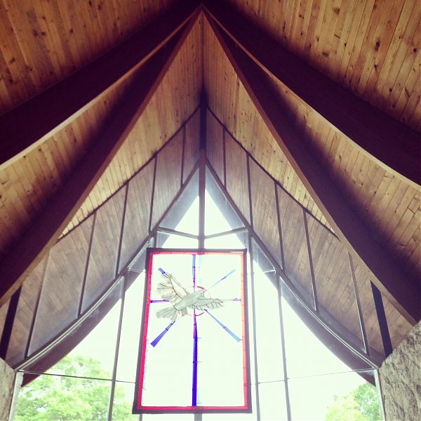
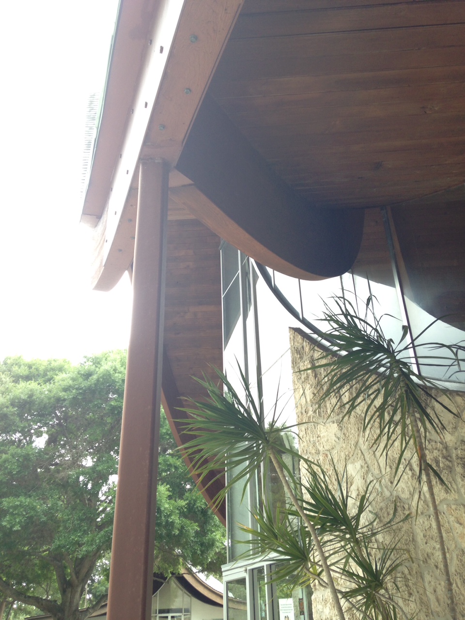
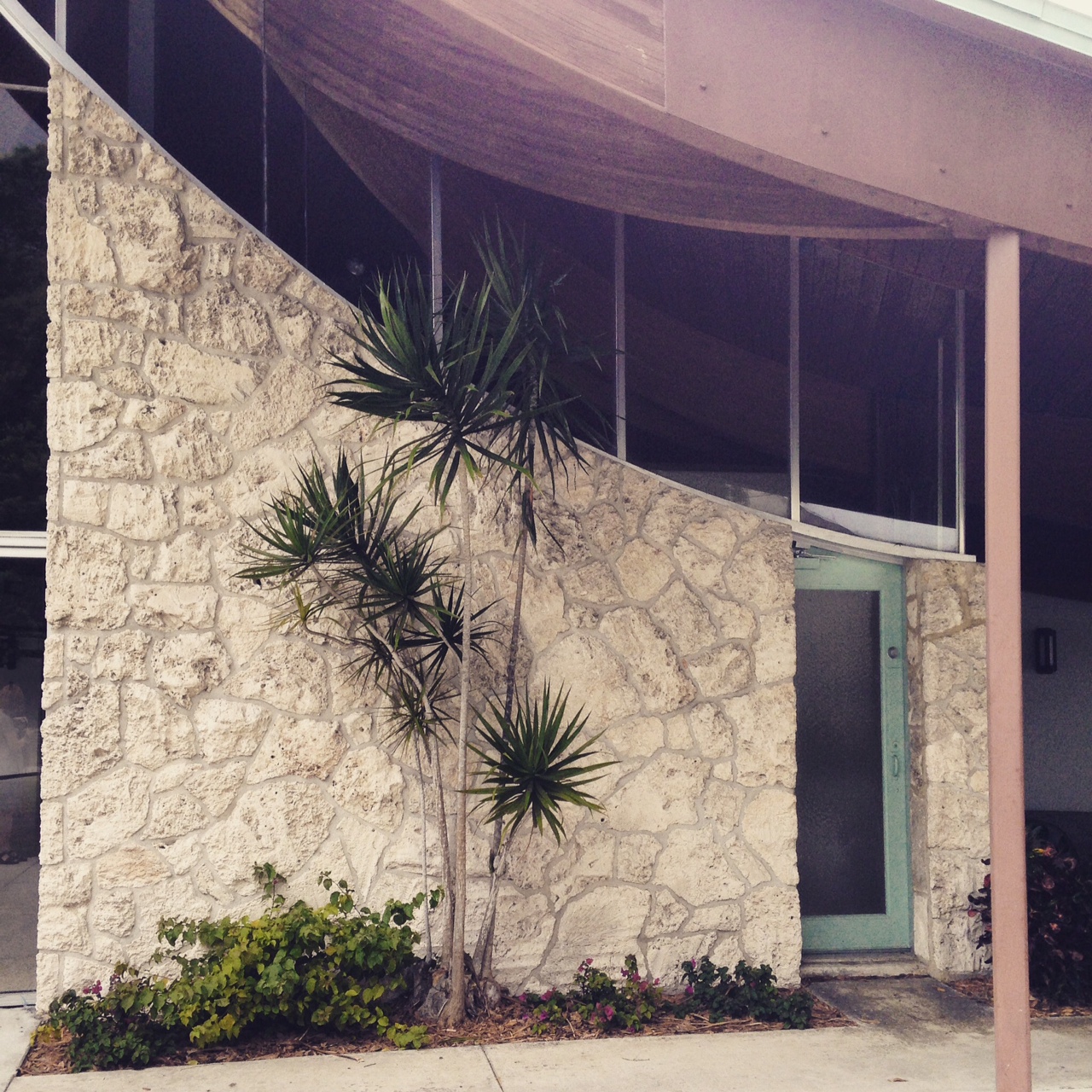
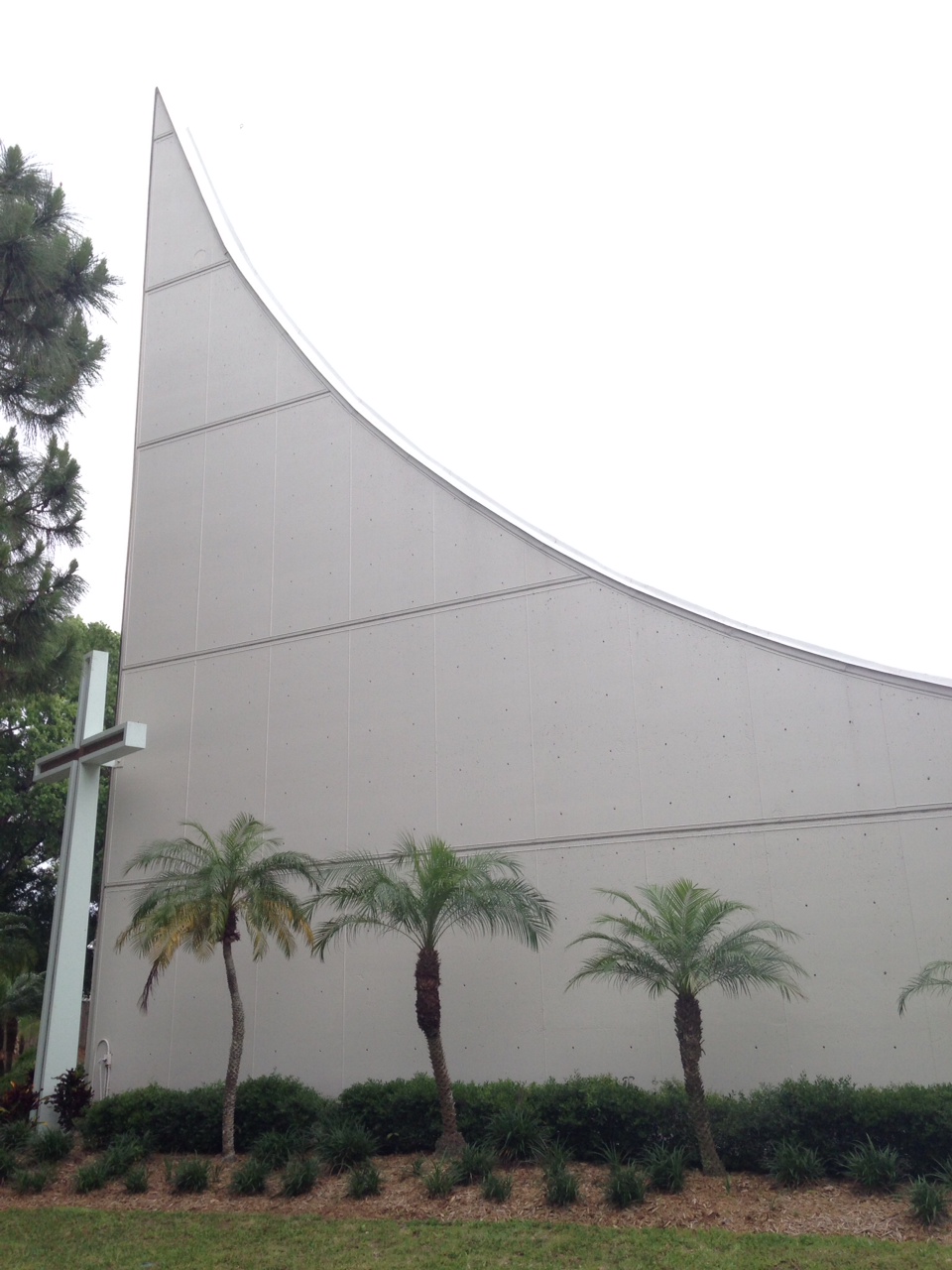
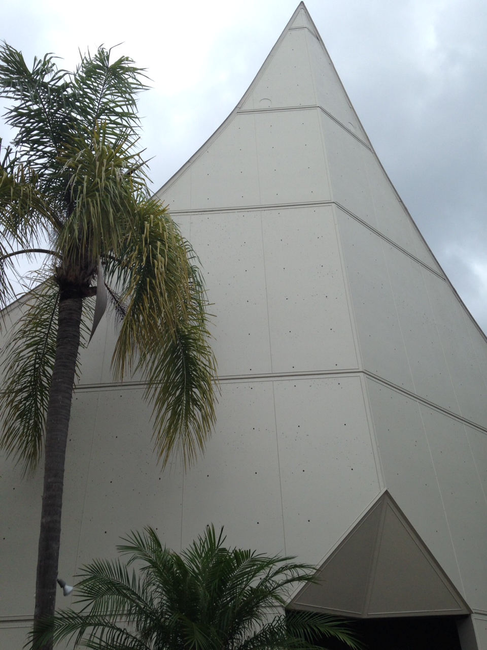
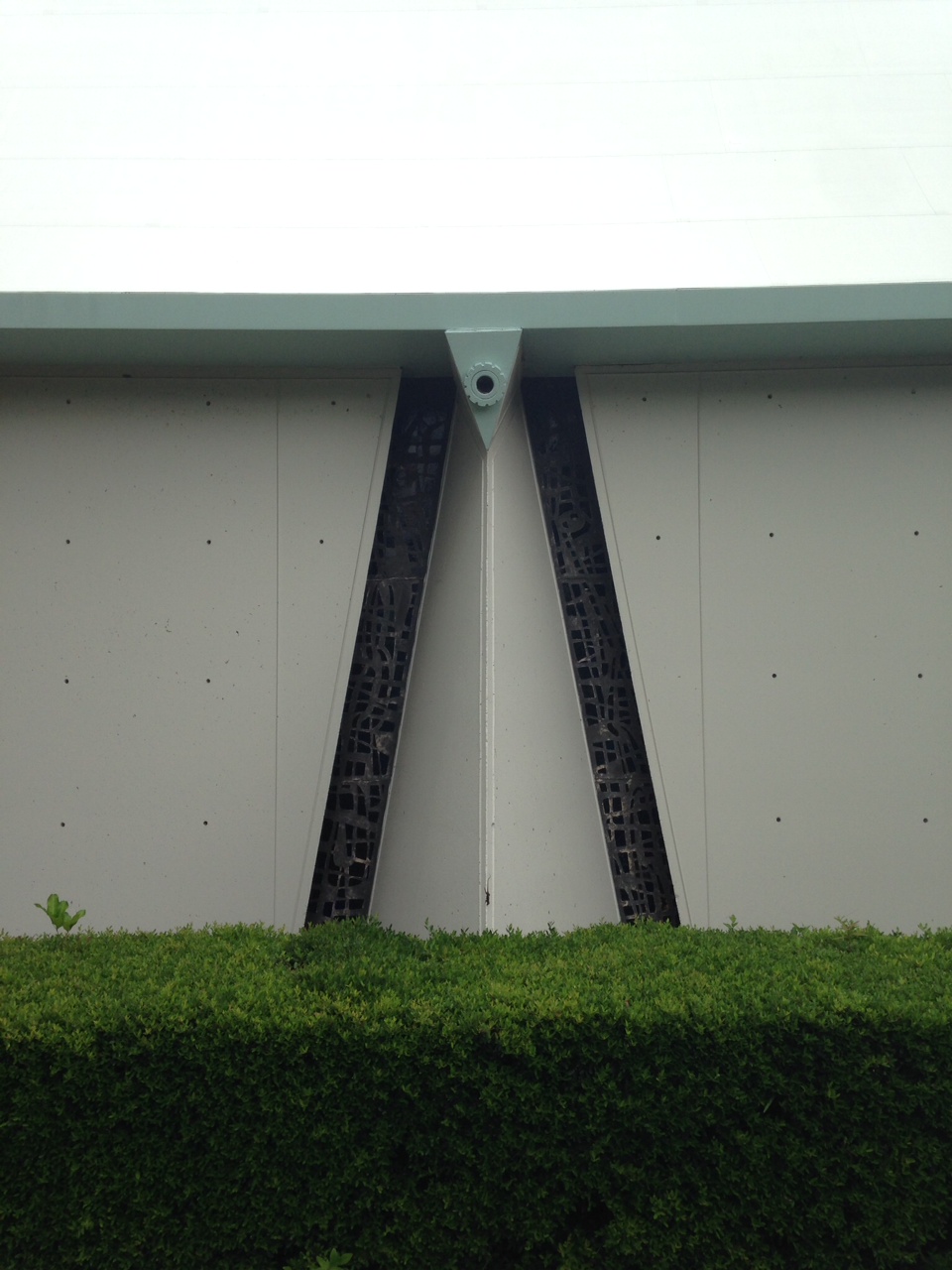
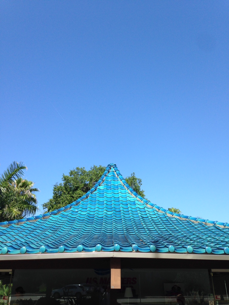
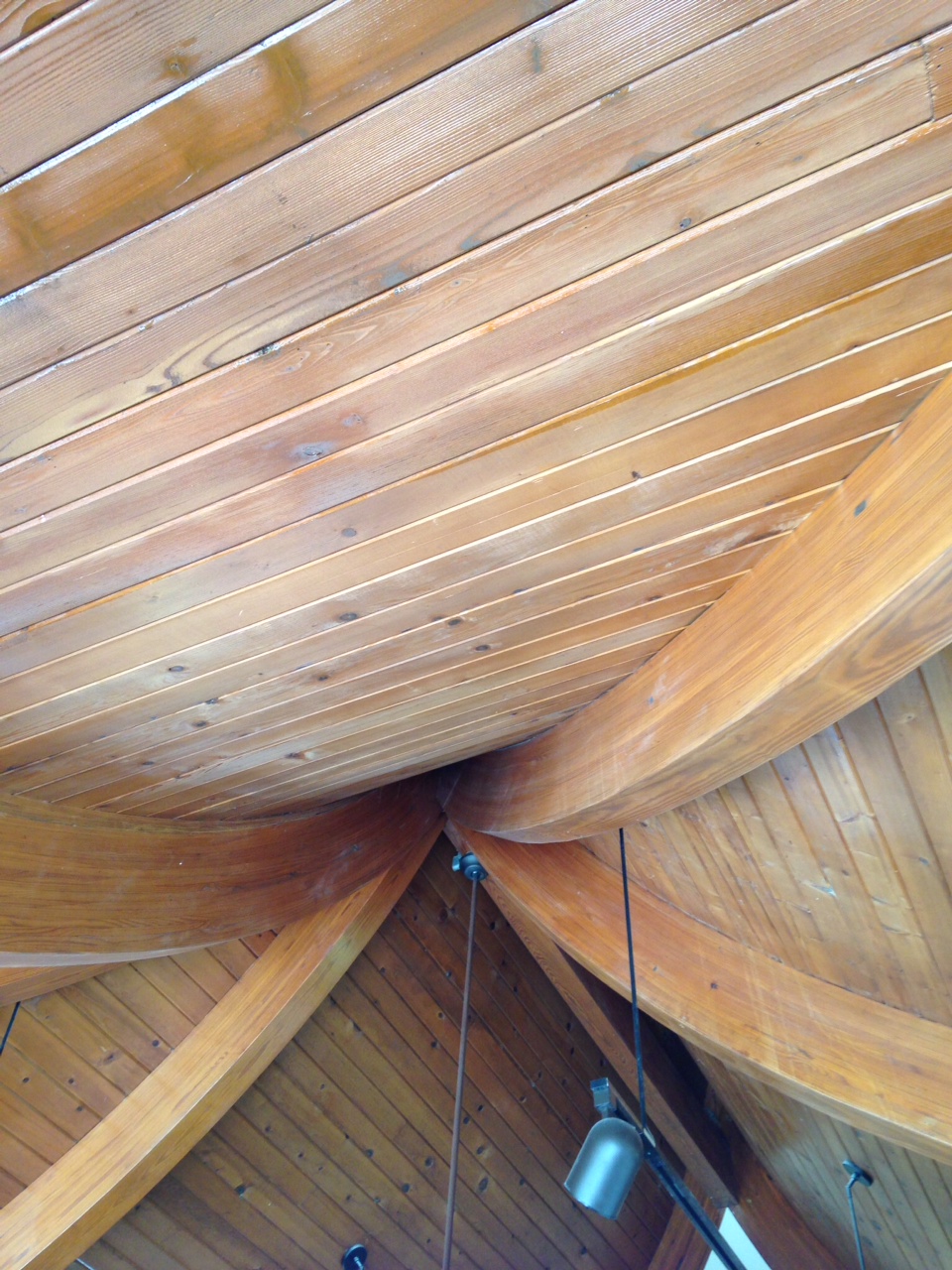
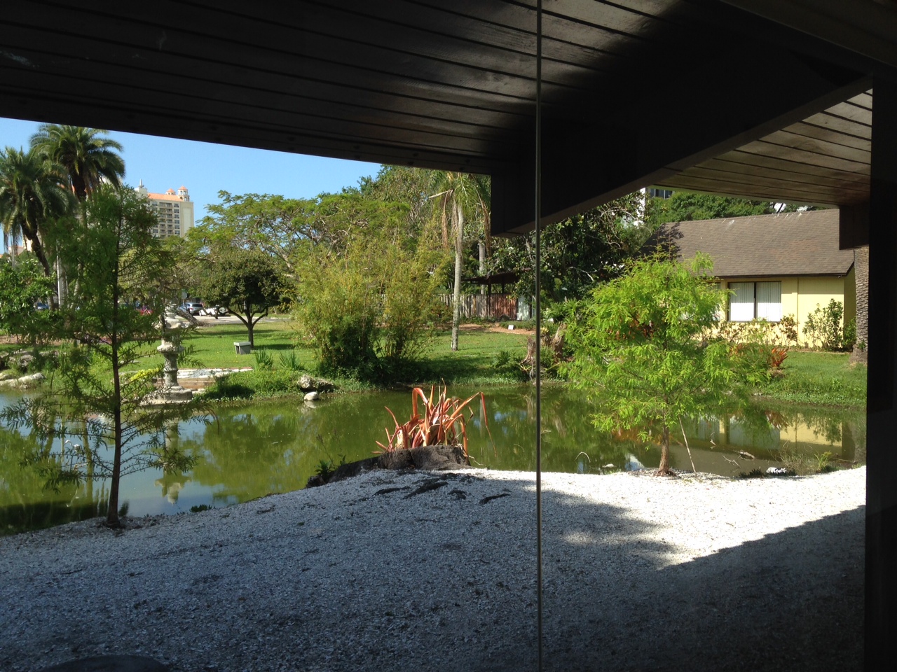
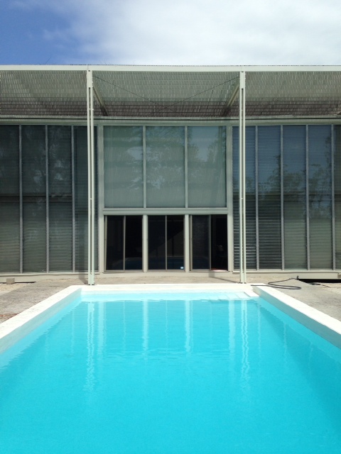
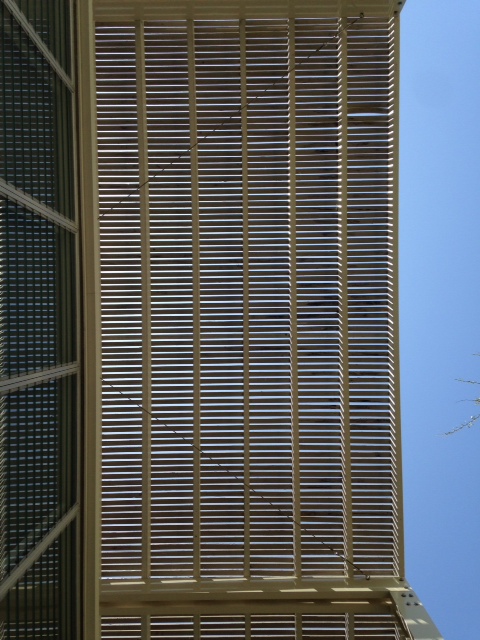
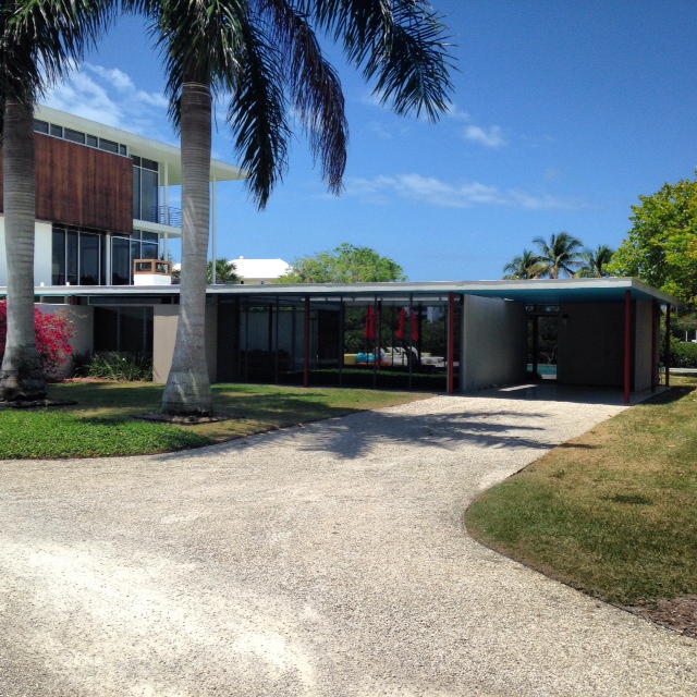
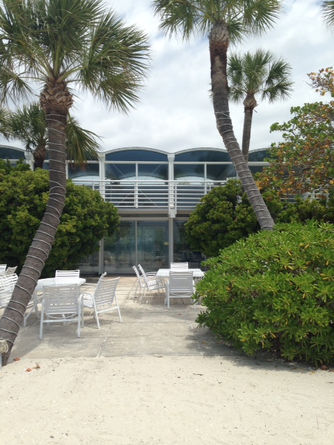
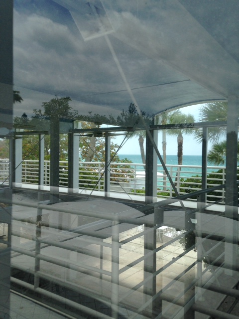
Portfolio | Victor Lundy in Sarasota
St. Paul's Fellowship Hall, Victor Lundy, 1959
My trip to Sarasota gave me my first chance to experience the work of Victor Lundy, one of those second-generation modernists who did not quote fit the pattern. His work can look Mayan, Scandinavian, and occasionally Brutalist. The three buildings I saw, like his famous First Unitarian Church in Westport, CT, share a roof-like that looks both like a boat and (when done in blue-glazed tile) like a pagoda. Lundy is still alive, and Mimi Zeiger interviewed him for Dwell at his home in Houston in 2008.
It is hard to ascribe a particular signature to his buildings; each takes shape based on site, program, and materials. His 1965 masonry facade for IBM’s complex in Cranford, NJ simultaneously evokes a mainframe computer and a Mayan temple. But there is a certain attitude: the forms and spaces are rich, but the architect makes complicated structures look effortless. “With every problem I make these images out the blue—initial responses—and then I fuss with them, refine, change, and discard. I work towards the irreducible,” Lundy explains. The concept for the sculptural Unitarian Church (1959-65) in Westport, CT is simple: two halves of the hyperbolic roof rise in unison supported by laminated beams, to a peak, but never meet. It captures the church’s belief in an “open question.”
In 2014, the General Services Administration made a documentary on Lundy, the architect of the U.S. Tax Court in Washington, DC. That video is also embedded at the end of this post.
St. Paul’s Lutheran Church, Victor Lundy, 1968
Sarasota Chamber of Commerce (The Pagoda Building), Victor Lundy, 1956

Overwrought Shell Conceals Porous, Visitor-Friendly Design in Renzo Piano's New Whitney Museum
Donald Judd + Renzo Piano. Photo by Max Touhey
The best view of the new Whitney (which opens today) is west on Gansevoort Street, if by best view you mean the one where Renzo Piano Building Workshop’s $422 million museum building makes sense. From there, just outside Gansevoort Market, you see the four levels and 50,000 square feet of galleries stepping back above the leafy frill of the High Line, the thrust of the exterior gray steel staircase, a fire escape on steroids, and the sawtooth skylights that say Art Lives Here. The mind edits out the concrete core and the northern block that contains offices and conservation spaces, the back-of-house glimpsed only when the doors of the elevators open on the wrong side. From there, you can imagine those galleries as trays akin to the High Line trestle, an industrial framework for whatever sculpture, paintings or trees the curators choose to deploy.
That’s what Piano’s building wants to be: an elevated and unpretentious set of concrete floors, their edges exposed on the outside. That’s the prevailing idea, at least, when looking at the section sketches for the Whitney: emphasis on the floor as organizing principle, with natural light at the east and west ends, and minimal distinction between inside and out. A building closer to his firm’s hillside Genoa office—gorgeous, green, light-filled trays stepping down a slope—than to either his Neoclassical art palaces, with their fussy layers of scrim and motorized shade, or the high-tech, guts-out Centre Pompidou. So why did he have to go and wrap the thing up? The pale blue metal shell, bulging and tapering, with jet-age round edge windows and sloping sides, has made critics think of many similes, few of them complimentary. Nothing on the inside speaks the same aeronautical language, and the carapace covers what the lumps and bumps seem to want to reveal: the split between back and front of house, which, in the case of the new Whitney, divides the northern exposure from the southern one. The museum would be much more powerful as architecture if it had articulated that split in simple, material language, the kind of back-to-basics choices made on the inside. (A similar move, intriguingly, that Piano’s firm used for the High Line Headquarters building right next door, made of exposed steel and dark brick.)
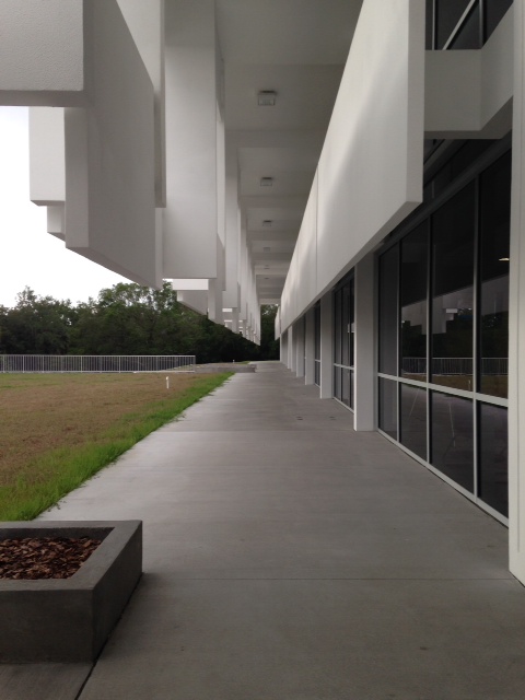
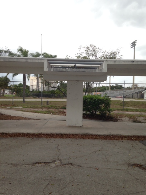
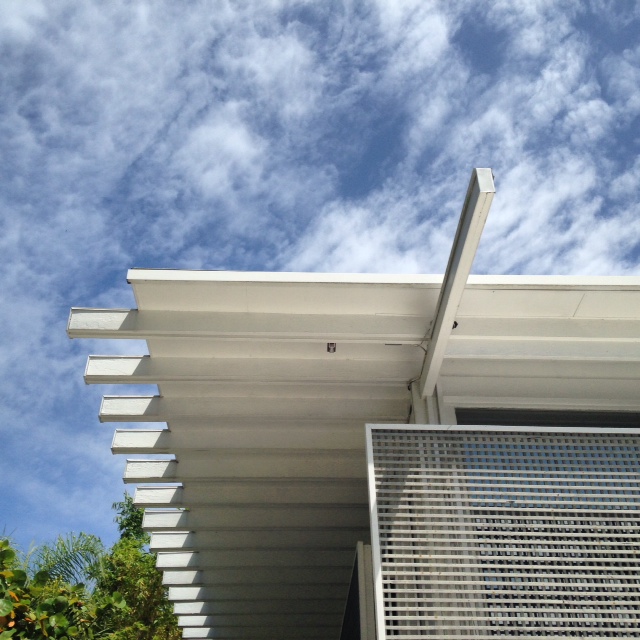
Portfolio | Paul Rudolph in Sarasota
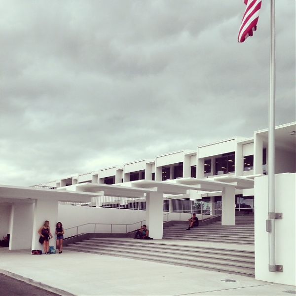
Sarasota High School and Canopy Walkway, Paul Rudolph, 1960
I took a very very short trip to Sarasota last week to speak to the Sarasota Architectural Foundation about “Modernism for the Masses” — museums, department stores and boutiques that showed Americans how to update their homes, starting in the late 1930s. It was a thrill for me to finally see a little bit of the Sarasota School and especially the early work of Paul Rudolph. In the houses of the early 1950s you can see many of the leitmotifs that would show up, much bigger and in concrete, in his work in the northeast. Canopies, hanging staircases, multiple level changes and overlooks all appear in delicate colors and almost miniature form. Ezra Stoller’s photographs of the Umbrella House make it look monumental, but it is tiny (and I am a short person). The SAF is currently involved in a battle to save the Rudolph canopies at the high school, concrete mushrooms that connected the then-new school to its neo-Gothic predecessor. Rudolph’s Riverview High School was torn down in 2009.
Umbrella House, Paul Rudolph, 1953
Harkavy House, Paul Rudolph, 1957
Revere Quality House, Ralph Twitchell and Paul Rudolph, 1949
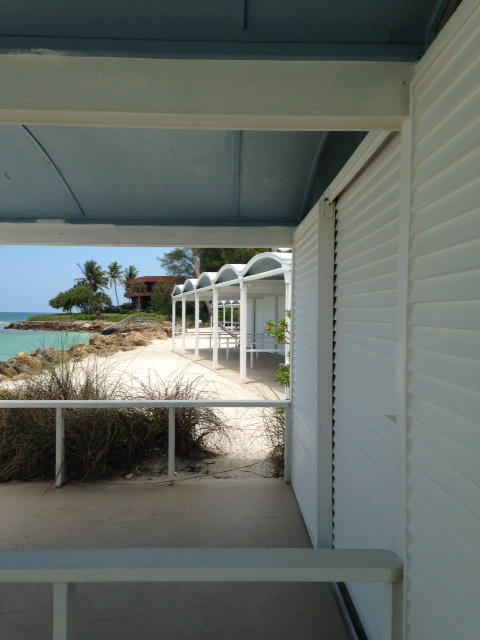
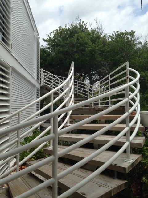
Sanderling Beach Club and Cabanas, Paul Rudolph, 1953
On X
Follow @LangeAlexandraOn Instagram
Featured articles
CityLab
New York Times
New Angle: Voice
Getting Curious with Jonathan Van Ness