Reducing Spectacular to Simple
Helene Binet, Koluma 01, by Peter Zumthor. Courtesy Ammann Gallery.
In a world glutted with crystalline digital images of buildings to be scrolled, scanned and pinned, Hélène Binet’s architectural photography stands out for its reserve, its simplicity and an ineffable quality that comes from shooting on film. Her images can reduce a complex building on a spectacular site, like Le Corbusier’s monastery at La Tourette, to a series of vertical lines. “A lot of architecture photography is very tense because it is trying to convey a lot,” said Ms. Binet, 55, who has been shooting architecture for 25 years. “I photograph the phenomena that happen because the building is built a specific way.” She is the recipient of the 2015 Excellence in Photography award from the Julius Shulman Institute, and a related exhibition, “Hélène Binet: Fragments of Light,” will open on Saturday at the Woodbury University Hollywood Gallery in Los Angeles.
Philip Johnson's Not Glass Houses
Grainger, the 18th-century farmhouse where Philip Johnson and David Whitney watched TV. Photo by Dean Kaufman.
In the beginning, there were two: the Glass House and the Brick House, both about 50 feet long and finished within months of each other in 1949 on a five-acre plot, with a 90-foot-wide grassy court separating them. History has downplayed the Brick House — from the outside it’s plain and it doesn’t fit well with the people-in-glass-houses narrative — but architect Philip Johnson always knew it would be impossible to live entirely in the open, so he built a place to get some privacy.
The rest of the buildings came naturally, if gradually. The idea of having a slew of small houses for different activities, moods and seasons, complemented by decorative “follies,” was Johnson’s conception for the site from early on. He called it a “diary of an eccentric architect,” but it was also a sketchbook, an homage to architects past and present, and to friends like the dance impresario Lincoln Kirstein, after whom Johnson named one of the follies he built on the property, a 30-foot-high tower made of painted concrete blocks.
In contrast to their whirlwind weekday world in Manhattan, Johnson and Whitney saw life in New Canaan as perpetual camping, albeit of a luxurious, minimalist sort.
Portfolio | East Midtown
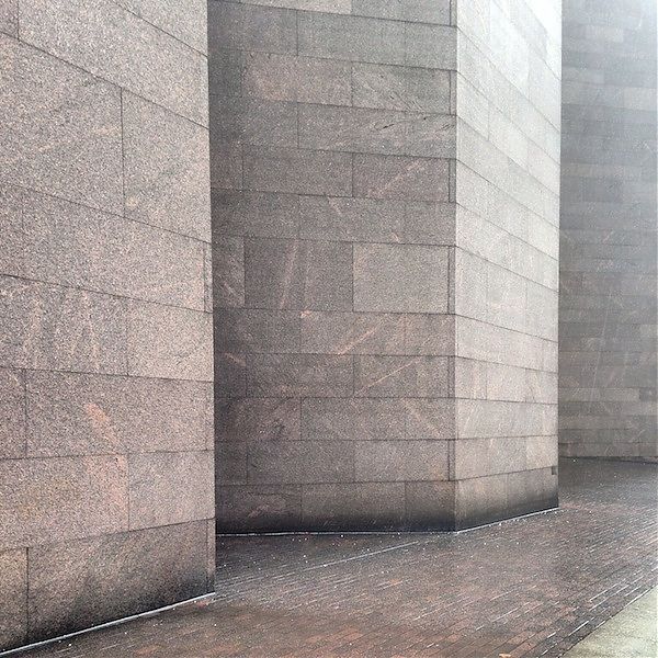
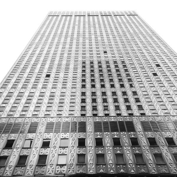
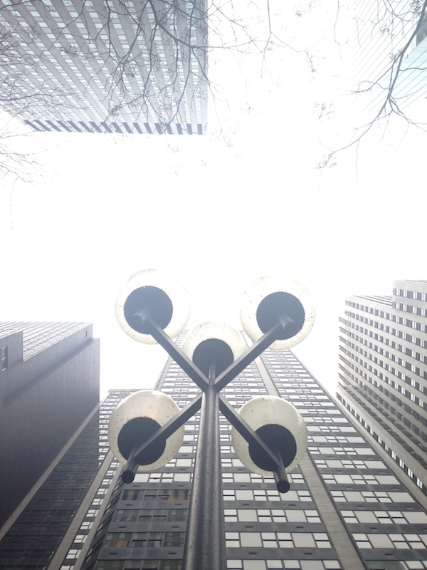
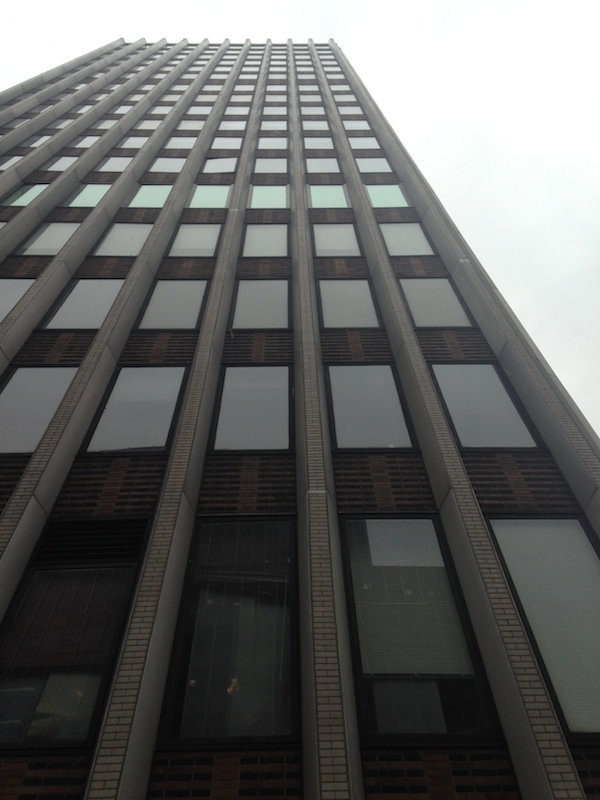
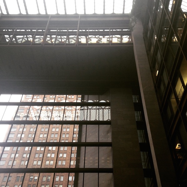
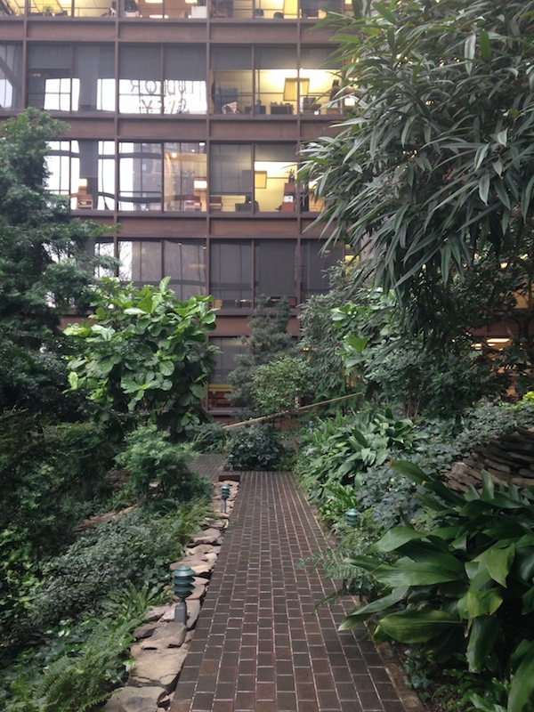
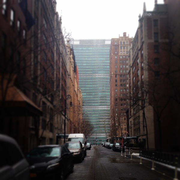
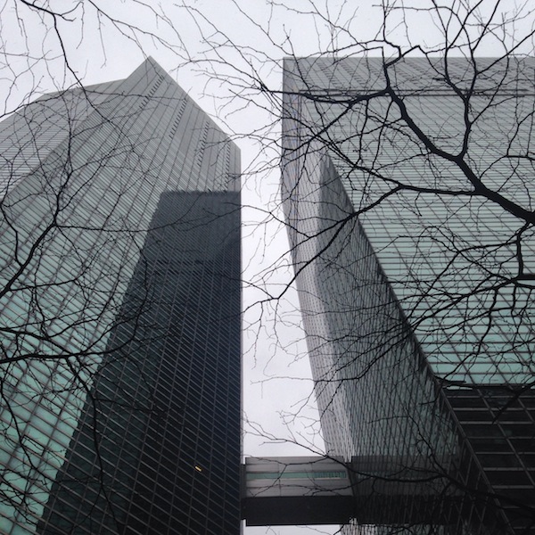
Walking east from Grand Central, a short tour of proto-, High, and proto-Post modernism, courtesy Raymond Hood, Harrison & Abramovitz, Kevin Roche and John Dinkeloo. Harrison and Roche both worked on the UN Secretariat as well, credited to Oscar Niemeyer and Le Corbusier.
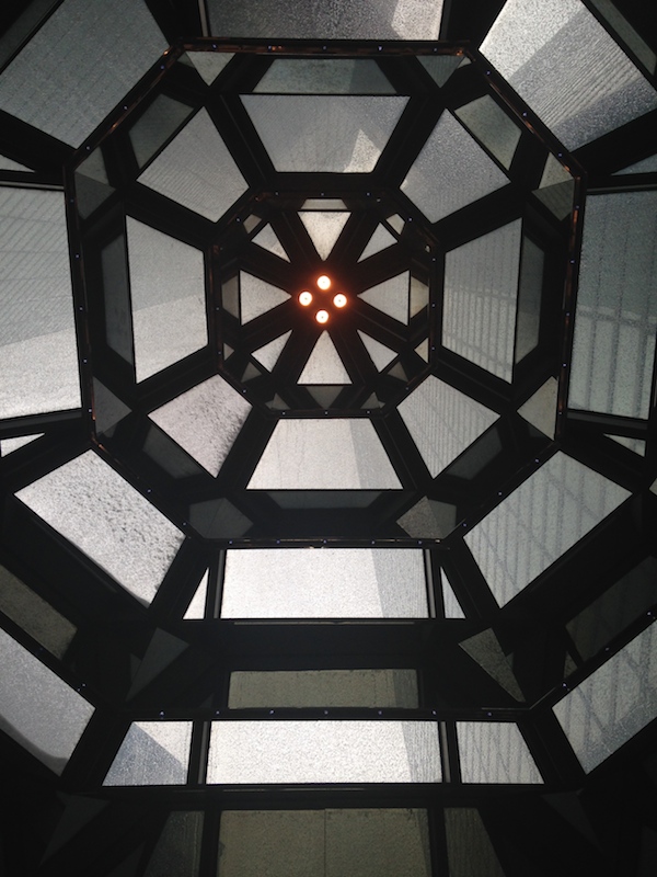
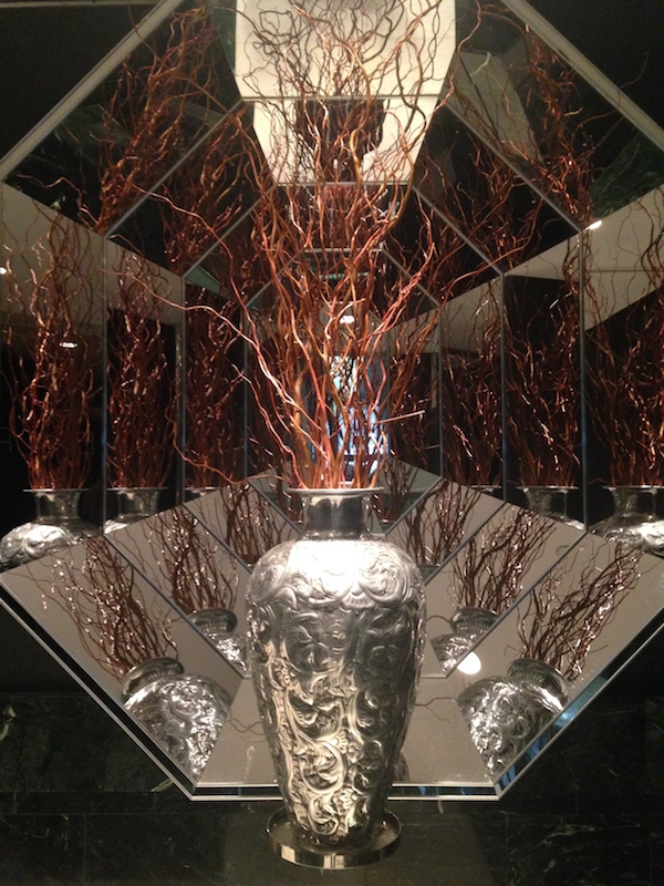
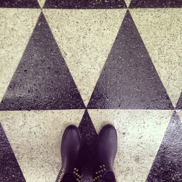
Portfolio | Architecture at the Met
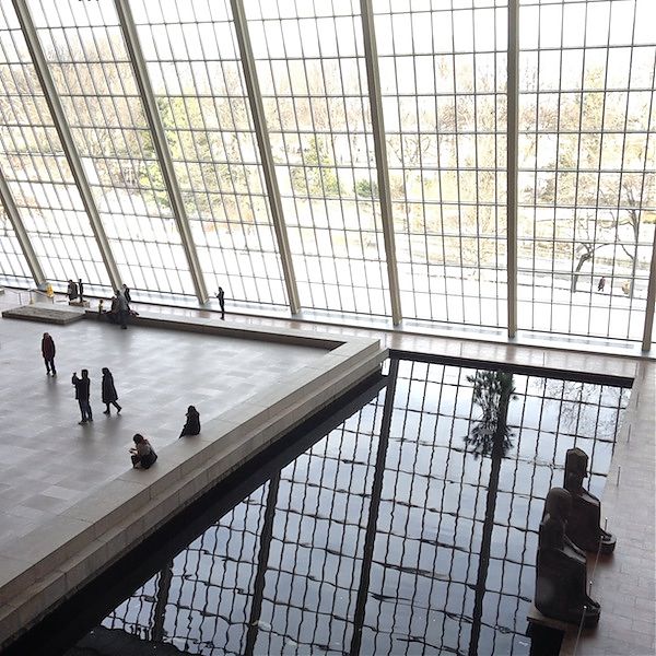
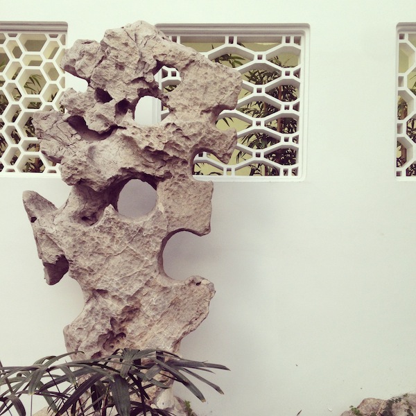
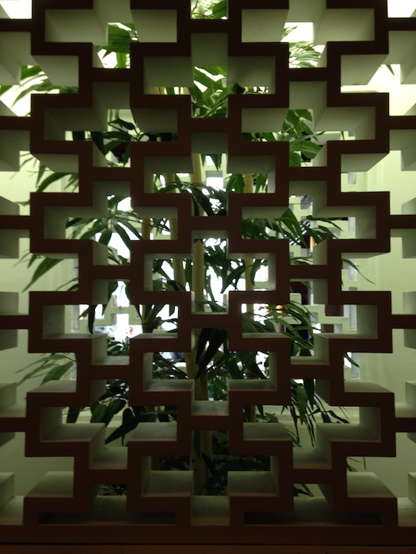
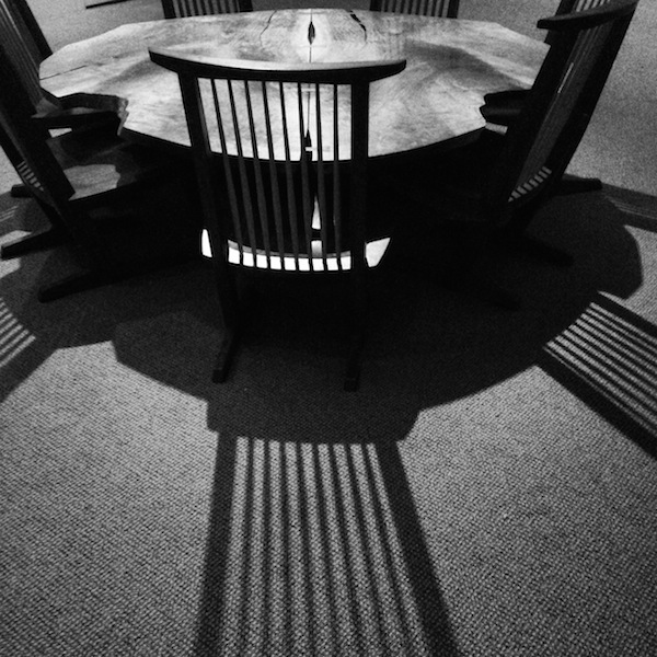
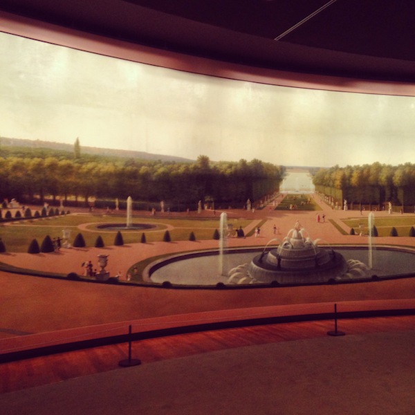
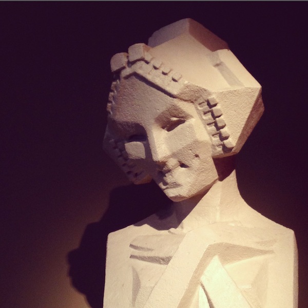
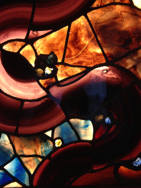
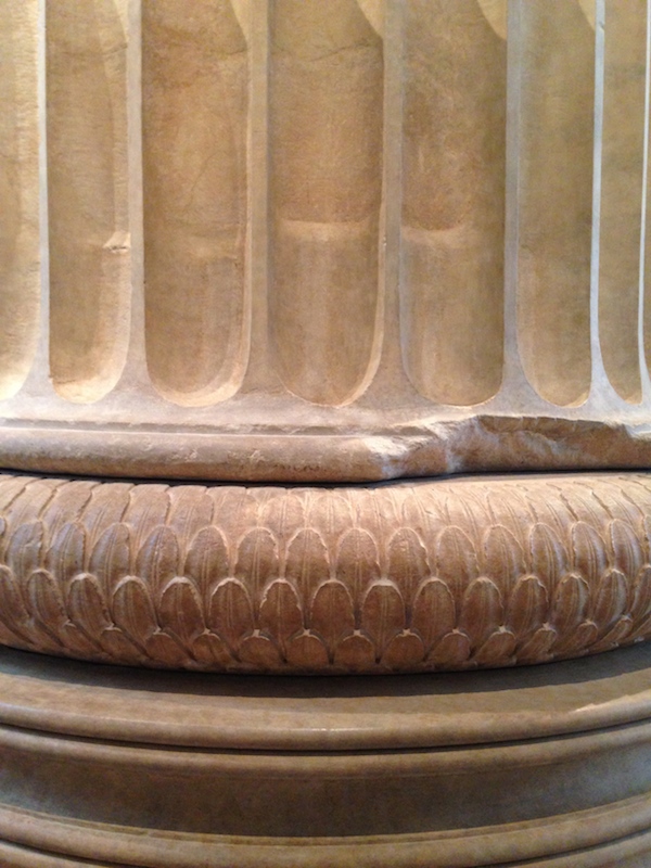
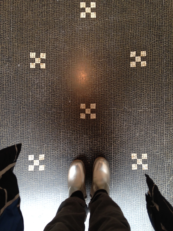
Top to bottom: Temple of Dendur from the Japanese galleries; Astor Court (2); Nakashima furniture in the Japanese galleries; John Vanderlyn’s Versailles panorama in the American Wing; ‘Sprite,’ Frank Lloyd Wright, salvaged from Midway Gardens; abstract Tiffany glass; details, Greek and Roman galleries (3).
After the cubicle
“We are now at an all-time low in square footage allotted per worker, and that’s because of the disappearance of paper and files into computers, and the appearance of headphones. In fact, I think of headphones as an invisible cubicle because they are the only things that make work possible in such close quarters.”
English Heritage adds 14 post-war office buildings to its protected lists
Rainbowed

Noticed: A revival of a trend that I associate with the 1980s, rainbows! In decor, in architecture, in fashion, and a perpetual interest of children’s book authors. I rounded up a few of the most stylish examples on a Pinterest board, and will keep adding as I see more. Something I can’t find, but someone who does screenprinting should make, is a simple navy sweatshirt with a ROYGBIV arc on the front. There’s a market.
"Was it too much to hope for first a woman and then a partnership?"

Denise Scott Brown, photographed by Robert Venturi.
When I read that Moshe Safdie had been awarded the 2015 Gold Medal by the American Institute of Architects, I groaned online. AIA members, I think you need to ask yourselves: “Does the AIA represent me?” Why? Because after tiptoeing toward the future, American architecture’s professional organisation seemed to have reverted to an old playbook. At a moment when some pundits are arguing that architects are bad listeners, while others question the limits of their ethics, and critics and curators find themselves focusing, more and more, on things built that aren’t buildings, choosing Safdie, and releasing the inane #ilookup video, neither rallies the troops nor sells architecture to the wider public. What would? I don’t know, but I think leadership begins by looking within.
2014 was the first year that the AIA Gold Medal could be awarded to two individuals, after a rapid 2013 campaign to amend the rules following the uproar over Arielle Assouline-Lichten and Caroline James’s petition to award Denise Scott Brown the Pritzker Prize – 22 years after partner and husband Robert Venturi won it alone.
The 2014 Gold Medal went to Julia Morgan – the first-ever to a woman, albeit one who had been dead for 56 years (previous posthumous medals, for Samuel Mockbee and Eero Saarinen, were given closer to those architects’ deaths). Morgan is certainly deserving, but then as now, I thought it was an easy choice, avoiding the politics of choosing a living, breathing woman architect before her male peers.
Portfolio | New Museum
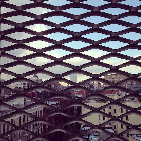
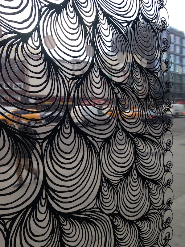
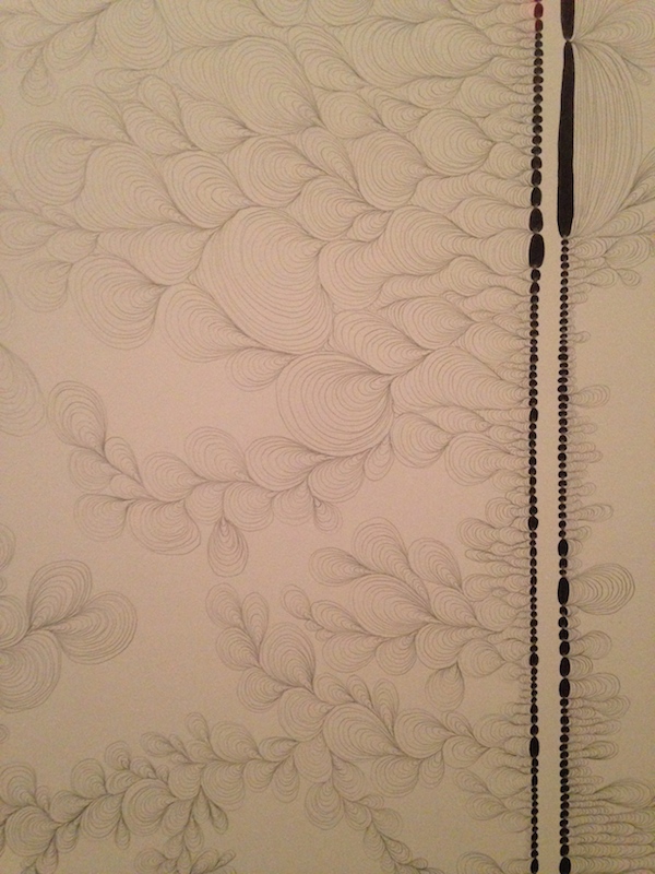
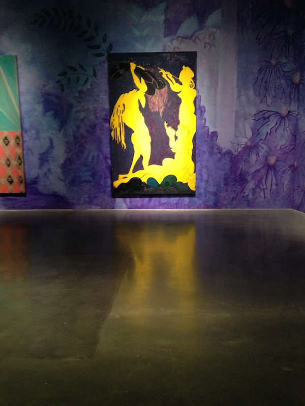
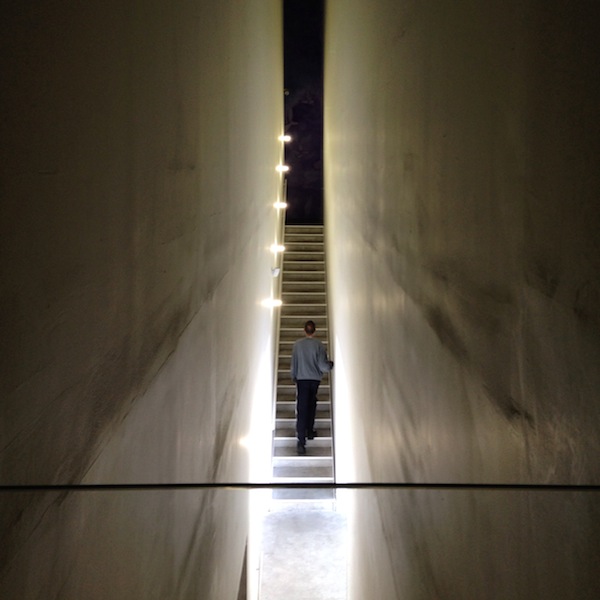
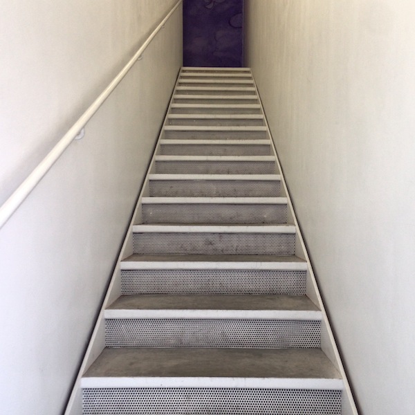
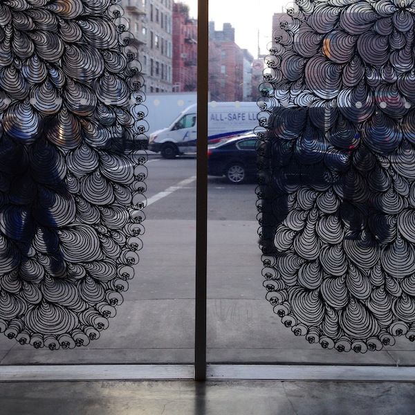
It’s been quite a while since I’ve been to the New Museum, and I wanted to catch the Chris Ofili exhibit before it closed on February 1. I took only a few photographs of the exhibit because it left me underwhelmed. The new paintings seemed thin and derivative — if you create a dark room with dark paintings, they had better have the power of the Rothko Chapel — and the figural shapes reminded me of German Expressionism, but without the added richness and layering of Ofili’s earlier work with sequins, collage, and elephant dung. I did like some of the drawings, one photographed here, that were transformed into films for the big windows on the museum’s first floor. Their aqueous shapes made a nice commentary on the museum’s metal carapace. In general I thought the architecture was looking a little sad. Dirty whites, paint-crusted metal edges, the incessant dinging and scraping of the elevator in that supposedly contemplative gallery. I’ve always liked the SANAA building conceptually, but its simplicity needs upkeep.
Free Ada Louise
My husband is an architect, which means he spends long hours at his computer with his headphones on listening to things. Mostly WNYC. Earlier this year, during a series of late nights in which he did not like their shows, he listened to all 66 hours and 11 minutes of Robert Caro’s The Power Broker. He found Caro’s book inspiring, and began poking around Audible.com for other architecture classics known but not read. He discovered On Architecture, the last collection of Ada Louise Huxtable’s columns, but couldn’t make it past the first few essays. The reader, T. David Rutherford, seemed never to have prepped on architect’s names, and hearing him mispronounce Mies was like nails on a chalkboard.
In the interest of calling attention to the need for a new recording of Ada Louise by someone versed in architect’s names (and, may I suggest, a woman? A critic, of all writers, should be heard in something you can imagine as her own voice) I decided to record an essay myself. I picked the dully titled “A Look at the Kennedy Center,” published in the New York Times on September 7, 1971, for its many famous witticisms. I’m no professional, but you do want to listen to the end.
After you’ve listened, please share with your version of this message: In 2015, Ada Louise deserves better audio. Maybe you also want to record your own?
Stoking a California Dream
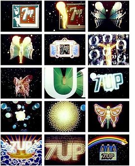
Early animated abstractions by Robert Abel and Richard Taylor for 7-Up.
“It is common practice today to place the word ‘California’ in front of almost any vagrant word and thus achieve a magic combination hopefully intended to make the heart jump and the purse strings fly open,” the designer Alvin Lustig wrote in 1947.
But it wasn’t the word alone. Mr. Lustig and other graphic artists gave “California” a look, for periodicals, posters, packaging and vacation destinations, that also made the heart jump and loosened the purse strings. It was colorful, it was experimental, it was rough, it was digital.
And the same can be said of the new book Earthquakes, Mudslides, Fires & Riots: California Graphic Design, 1936-1986 (Metropolis Books, $55), written and designed by Louise Sandhaus, 59, a graphic designer. As she writes in her introduction, she chose not to honor text over graphics, and she wasn’t interested in being definitive. Rather, looking through archives and talking to makers, she asked questions like, “Is this historically important work, versus is this fabulous and distinctive and sooooooo California?” The pieces in the book range in mood from the calm abstraction of John Follis’s “Arts & Architecture” magazine covers to the pixelated trips in David Theurer’s “I, Robot” Atari game.
Oh, and that title? Ms. Sandhaus wrote in an email, “It’s a cliché about California, but one that encapsulates a place where big dramatic changes happen.”
On X
Follow @LangeAlexandraOn Instagram
Featured articles
CityLab
New York Times
New Angle: Voice
Getting Curious with Jonathan Van Ness