A Gordon Bunshaft Top 10

In this morning’s New York Times there was an article about new Hirshhorn Museum director Melissa Chiu and her plans for the museum in our nation’s “staid capital.” Late in the article, Graham Bowley referred to the museum’s “round, nearly windowless building, designed by Gordon Bunshaft.” Now, I took the photo at the top of this post in 2013, so unless they have filled in the wall of windows on the interior of the building’s donut, it certainly has quite a few. I am a fan of both Bunshaft and the building, and I felt the description was inaccurate and did not do the building justice. It is popular to make the Hirshhorn sound too difficult for art, and too many buildings of its era (1974) have recently suffered death by a thousand pinpricks of disdain.
So I wrote to the Times asking for a correction, and this is what they said:
Dear Ms. Lange,
Thanks for taking the time to write.
After consideration, we’re comfortable with our assertion that this building is nearly windowless.
Thanks again for writing, and for reading The Times.
Now, more than two can play that game.
Per
— Kriston Capps (@kristoncapps) October 30, 2014LangeAlexandra</a>, the NYT insists that the <a href="https://twitter.com/hirshhorn">hirshhorn has no windows. Despite the entire interior cylinder. Plus: pic.twitter.com/jRY4G79aW5
If I were a data journalist I would calculate what percentage of the Hirshhorn facade is windowless.
— Alexandra Lange (@LangeAlexandra) October 30, 2014
LangeAlexandra</a> <a href="https://twitter.com/nytimes">nytimes interior ø ofhirshhorn</a> ≈ 53% of exterior ø. If windows ≈ 80% of inside surface, then ≈ 42% of façade is windows.</p>— Deane Madsen (deane_madsen) October 30, 2014
Ted Grunewald pointed out that Ada Louise Huxtable didn’t like it.
.
— Theodore Grunewald (@TedGrunewald) October 30, 2014LangeAlexandra</a> <a href="https://twitter.com/kristoncapps">kristoncapps "It lacks the essential factors of esthetic strength and provocative vitality" 1/2
— Theodore Grunewald (@TedGrunewald) October 30, 2014
LangeAlexandra</a> <a href="https://twitter.com/kristoncapps">kristoncapps "that make genuine ‘brutalism’ a positive and rewarding style." —Ada Louise Huxtable 2/2
But I don’t think of the Hirshhorn as brutalist, but rather as part of Bunshaft’s long exploration of raised geometric shapes. It may be referential, but it is a striking interpretation of modernism in Neo-Classicalland, and has qualities of mystery and discovery that are rare. So I offer my Gordon Bunshaft Top 10, in order of my own discovery, for further exploration.
1. Lever House, New York, 1952. My favorite building in New York. Better than Seagram.
2. Beinecke Library, Yale University, 1963. Almost surreally white, with an incredible amber glow, via translucent stone panels, on the interior.
3. Connecticut General Life Insurance Company, Bloomfield, CT, 1957. The topic of the first chapter of my dissertation, on suburban headquarters. One of the earliest with an all-star design team (Bunshaft, Knoll, Noguchi).
4. Albright-Knox Art Gallery, Buffalo, NY, 1962. Just sublime.
5. Manufacturers Hanover Trust, New York, 1954. Now Joe Fresh :(
6. Air Force Academy, Colorado Springs, 1962. Designed with Walter Netsch, the chapel at the academy is more intricate and experimental than most Bunshaft.
7. Hirshhorn Museum and Sculpture Garden, Washington, DC, 1974. See above.
8. Marine Midland Building, New York, 1968. Ada Louise likes this one. The Noguchi ‘Red Cube’ out front is also on the cover of my book.
And now, a couple of lost Bunshafts.
9. Travertine House, East Hampton, NY, 1963. Destroyed by Martha Stewart.
10. Emhart Manufacturing Headquarters, Bloomfield, CT, 1963. A Victim of Corporate Vandalism indeed. Connecticut General almost met the same fate.
[Photo credits, top 10: All Ezra Stoller/ESTO except Air Force Academy (Stewarts Commercial Photographers/Pikes Peak Library District); Marine Midland (Francis Dzikowski/Isamu Noguchi Foundation); Travertine House (Adam Bartos).]
Elsa or Else

The New Yorker’s 2014 Halloween cover should look something like this: high angle on a shadowed cul-de-sac, pools of light illuminating the street. In those pools, row after row of tiny Elsas — the heroine of “Frozen” — snowflake crowns glimmering, blue skirts shimmering, hands on hips in Wonder Woman’s power pose. All the other kids, the ghosts and Spider Men, Minecraft Steves and black cats, baby spiders and infant California rolls, are in shadow. Every Halloween has a pop-culture winner, and this year it’s “Frozen.” If your daughter thinks she’ll be the only one singing “Let It Go” at every house, warn her now.
I should know: I tried to get my three-year-old to switch to Sleeping Beauty.
Book: SQM, The Quantified Home
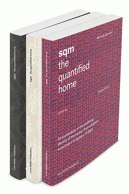
I contributed an essay titled “Edited Living” on the Pinterest Home to the new book SQM: The Quantified Home which just launched at the 2014 Biennale Interieur in Kortrijk, Belgium.
The way we live is rapidly changing under pressure from multiple forces—financial, environmental, technological, geopolitical. What we used to call home may not even exist anymore, having transmuted into a financial commodity of which the square meter is the basic unit. Yet, domesticity and the domestic space ceased long ago to be present in the architectural agenda. SQM charts the scale of this change using data, fiction, and a critical selection of homes and their interiors—from Osama bin Laden’s compound to apartment living in the age of Airbnb.
The book has contributions from Jacob Reidel, Keller Easterling, Joseph Grima, Hilde Heynen, Dan Hill, Sam Jacob, Justin McGuirk, Joanne McNeil, Jonathan Olivares, and Bruce Sterling, among others. The dust jackets are made of real wallpaper, a touch which I love, of course.
To give you a taste, here are the first few paragraphs of my essay.
The front door to the Pinterest house is charcoal gray, or lemon yellow, or turquoise blue. It says “Welcome” or “Hello” or “Hey, Y’All.” In winter it carries a monochrome wreath in white or red or gold. In April, rubber boots line up at its foot. In summer, it is surrounded by wisteria. In October, pumpkins pile up. Its number may be hand-painted, or pieced from tile, or set away from the wall, the better to create a crisp shadow. It likes to be photographed ajar.
The front door to the Pinterest house exhibits the characteristics of the houses collected on million-follower Pinterest boards named A Girl Can Dream and Nooks and Floored and Steal This Look. It is colorful. It has accessories. It is dressed for the season. It looks as though it is waiting for something to happen. Personifying the house, dressing it as one might a paper doll, is far from a leap: most pinners (70 million; 80 percent female; 60 percent American) have a picture of themselves at the top of their page. Below, a series of rectangles, each with a cover image, define that portrait through pictures of (mostly) other people’s stuff. domino magazine originated the idea of turning an outfit into a room. Pinterest proliferates it.
As media critic Rob Walker has written of visual collections in general, “It is everything we love about stuff—but without the stuff.” He theorized in 2011 that “simply pondering stuff has become a form of entertainment.” Pinterest, which launched in beta in 2010, would seem to prove his point, except for the “simply” part. Pondering stuff is indeed entertainment, but Pinterest has also become a powerful platform for sales. The types of images pinned to house boards, often further broken down into rooms, and parts of rooms, transform designing and making a house into a series of smaller and smaller purchases. It is not “from the spoon to the city” but a house built from a thousand spoons.
The Past and Future of Cemeteries
1921 aeriel view of Woodlawn Cemetery. Courtesy Avery Library, Woodlawn Cemetery Records.
“I would love to have been there when they called in their architect and said, ‘There’s one more thing you need to design for us,’ ” says Susan Olsen, imagining a conversation between the Standard Oil heir Edward Harkness and the architect James Gamble Rogers. Rogers designed the buildings that Harkness donated to Yale, Harvard, and Columbia; Harkness’s Fifth Avenue mansion; and, indeed, his final resting place: a neo-Gothic burial chapel at Woodlawn Cemetery, in the Bronx. Olsen, the director of historical services at Woodlawn, adds that Harkness was not alone in wanting a mausoleum in the same style, and created with the same hands, as his lifetime milieu.
As the new exhibit “Sylvan Cemetery: Architecture, Art and Landscape at Woodlawn” demonstrates, the cemetery is an ideal place to view work by leading architects, landscape designers, and artisans in close proximity, with gardens by Beatrix Farrand, Ellen Biddle Shipman, and the Olmsted Brothers, architecture by Rogers, McKim, Mead & White, and Carrère and Hastings, tile vaults by the Guastavinos, stained glass by Tiffany Studios, and sculptures by Gertrude Vanderbilt Whitney. Established, in 1863, as a more convenient alternative to Green-Wood Cemetery (early advertisements emphasized its location as only thirty minutes from Manhattan by train, unlike the ferry journey to Brooklyn), Woodlawn Cemetery tells a story rich with railroad lore, new-money positioning, design trends, and the history of craft.
Portfolio | Tongva Park
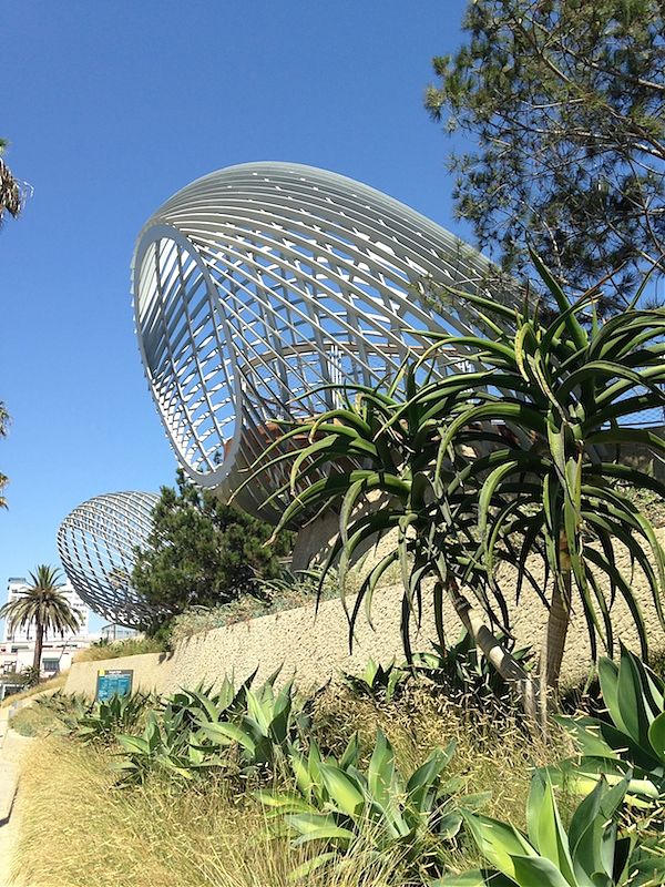
Quick thoughts on Tongva Park by James Corner Field Operations, which opened in Santa Monica in 2013.
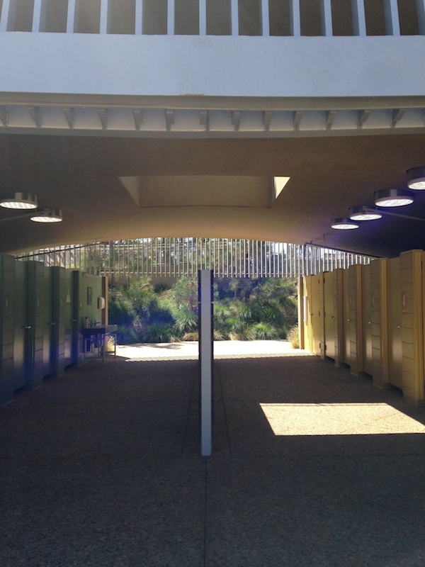
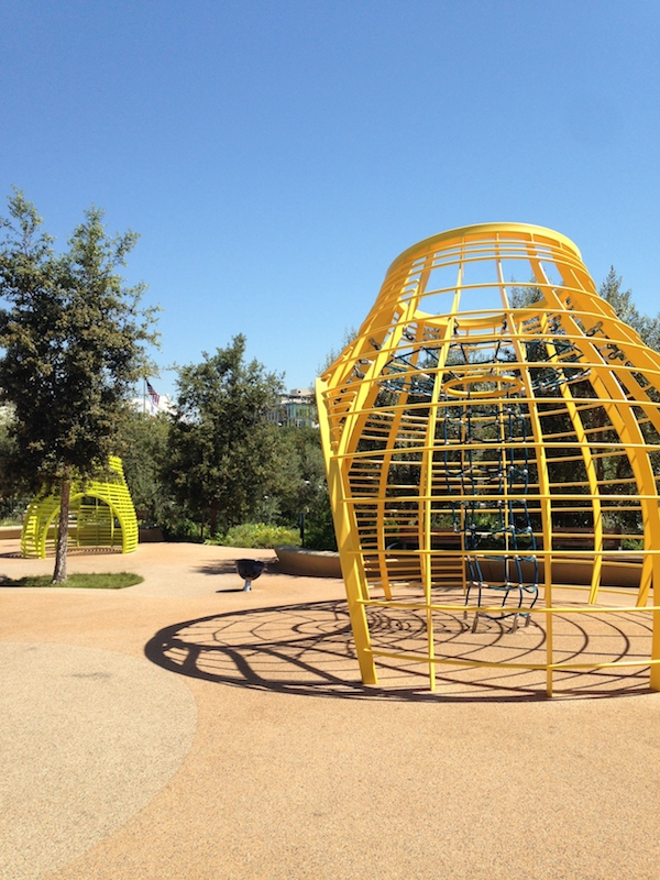
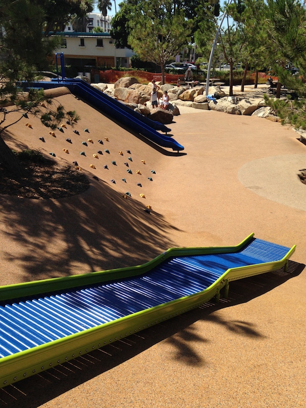
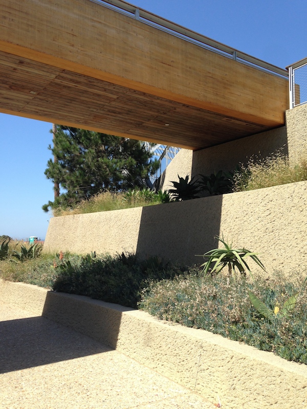
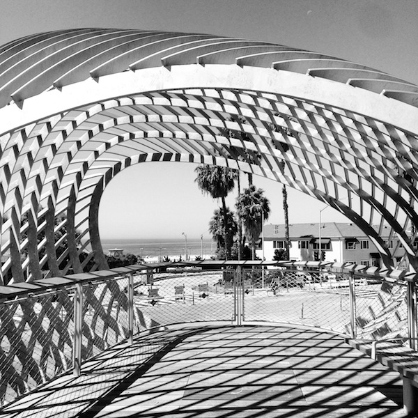
Pros. For the New Yorker, it is fascinating to see Field Operations working in a West Coast landscape vocabulary. Both the High Line and FO’s losing entry in the Governors Island park competition have a brooding, British heath quality that would have been entirely inappropriate in southern California. At Tongva Park you get the meandering paths and super-textured plantings, but the visual palette is entirely different. I also appreciated the incorporation of similar design elements in playground and grown-up park. There’s no reason kids zones have to be ordered from a catalog and look the same everywhere you go. The comfort stations, designed by Frederick Fisher and Partners, are among the nicest I’ve seen in a public park, and kudos for not defaulting to a variant of pink and blue. The paths, whose plan is supposed to mimic the structure of a leaf (West 8 has a similar rationale for those on Governors Island), do indeed offer opportunities to cut through to Santa Monica’s pretty City Hall, to get lost at the margins of the park, or ascend the stucco ramparts for a view of the ocean and the pier.
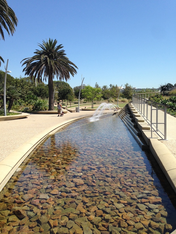
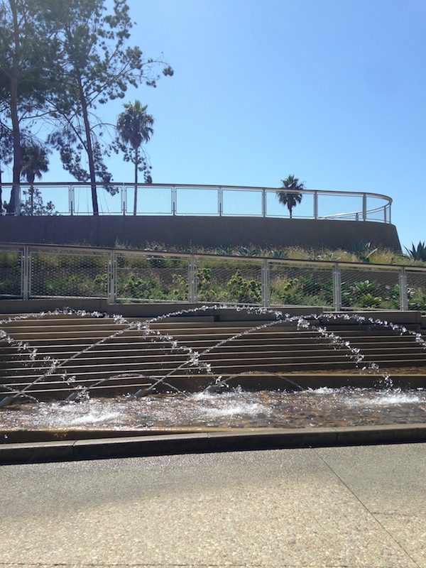
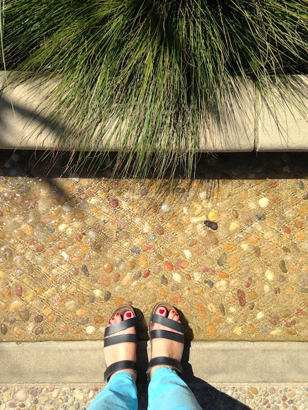
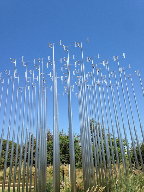
Cons. Those alien portals, which serve as as street-front billboards for the park, are really weird. I am told their form refers to baskets made by the Tongva people for whom the park is named but, like the leaf structure reference, this reads as ex post facto rationalization. The idea of a structure to float people up in the air is smart, but these provide neither adequate shade nor seating for a social group. The fountain that runs along the entrance path is pretty, but it seemed to be doing less than it could to cool its surroundings. It felt like there was room for more water in the park, either in the form of a bigger fountain or more fountains. I was there during the heat wave, but I’m also hoping in a few years there will be more shade. Several sad picnics under the few fleshed-out trees. Overall, there was something rather polite about the whole park, which is probably suitable to its setting and yet — amidst Santa Monica’s proliferating neo-modern condominiums — I think something wilder could work.
Further reading: Christopher Hawthorne’s review in the L.A. Times. The park’s own site with a helpful abstracted plan (see, it’s a leaf). And, because this is a new amusement, Yelp.
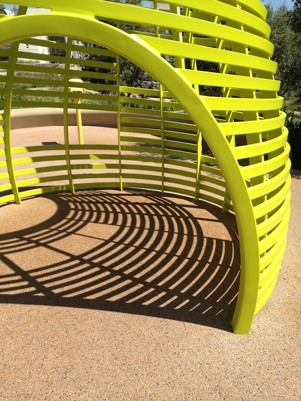
The Great Playscapes
Photo by Martha Clifford. Courtesy Herman Miller.
On September 27, Isamu Noguchi’s 1976 Playscapes reopened in Piedmont Park, after a restoration funded by Herman Miller Cares via Park Pride, and coordinated by the City of Atlanta’s Office of Cultural Affairs and Office of Parks. Playscapes, a set of colorful, architectural and flexible metal and concrete pieces set in a clearing in the wooded park, is the sculptor and Herman Miller designer’s only built playground in America, and the expression of decades of thinking and tinkering about the best way to get children moving, thinking, and exploring the natural world. Originally sponsored by the city’s High Museum of Art and the National Endowment for the Arts, the playground also demonstrated a commitment to bringing art to the people and to public spaces that resonates with the way we are making and remaking cities today. In projects from the High Line, which includes a children’s area in its recently-opened third phase, to the ubiquitous “splash pads” incorporated into center-city parks, we see Noguchi’s ideas at work. As art critic Thomas Hess wrote of one of Noguchi’s unbuilt projects, this “playground, instead of telling the child what to do (swing here, climb there), becomes a place for endless exploration.”
Portfolio | The Broad
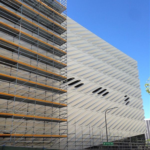
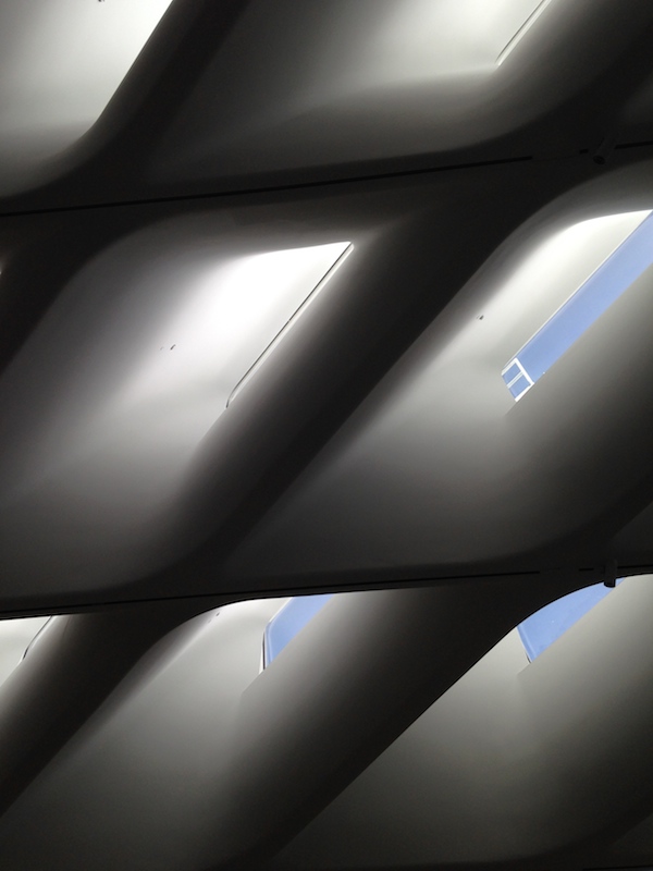
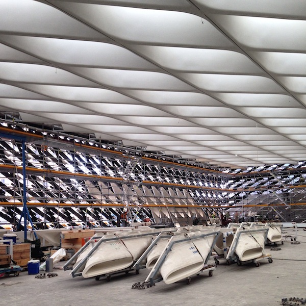
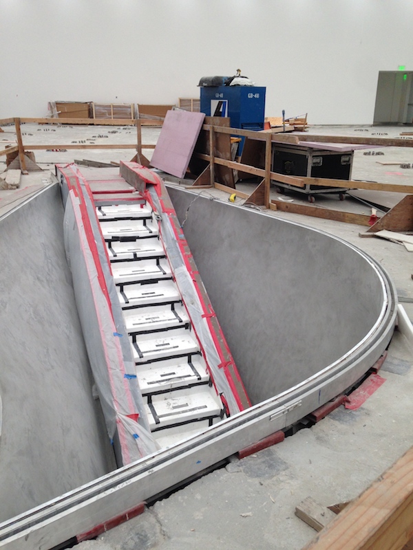
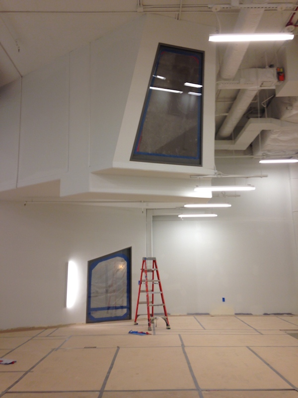
When I was in Los Angeles last month, I was able to set up a hardhat tour of The Broad, the contemporary art museum, designed by Diller Scofidio + Renfro, now under construction one block over from the Disney Concert Hall and across the street from MoCA. When completed, the museum will house the 2,000 works in Eli and Edythe Broad’s collections, with a select number on display in a top-floor gallery. The carapace of the building, called “The Veil” is made of a series of molded fiberglass-reinforced concrete panels, that come down to the ground and go over the top. The building’s floors, storage and circulation are housed in “The Vault,” a poured-concrete wedge that cantilevers up and over the lobby, and is pierced by a glass elevator, a theme-park escalator, and a cavernous staircase. Windows from that staircase will offer a glimpse into the paintings storage, and a sense of the depository physically and conceptually beneath the upstairs gallery. Even three-quarters finished, that room seemed to float.
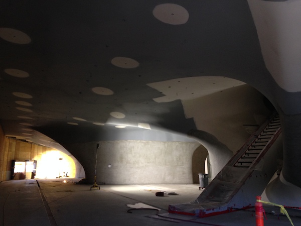
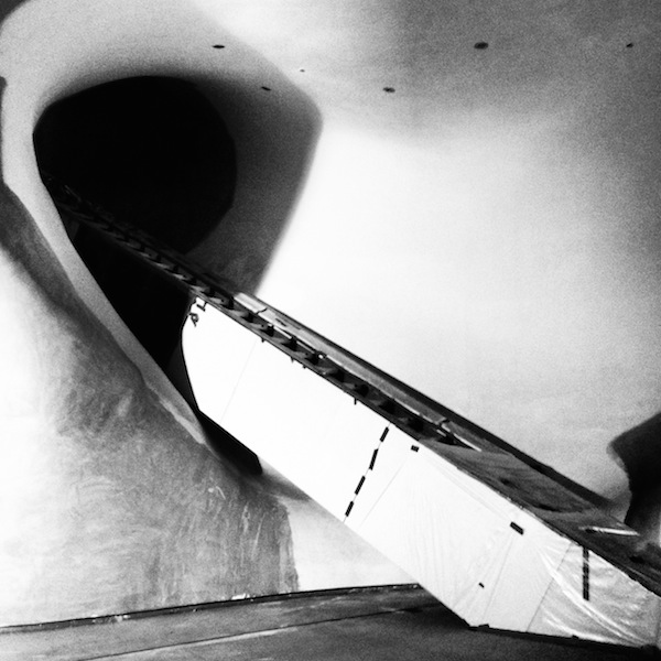
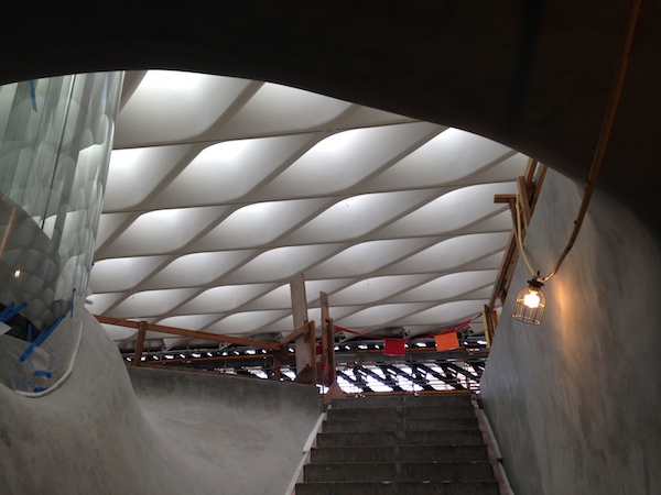
The museum was originally supposed to open by the end of 2014 (and indeed, I could get a pretty good sense of the architecture and spaces on the tour). Construction delays and a lawsuit have put off the opening date. I suspect a big party this time next year. Despite not always being a fan of the work of DS+R, I’m excited to see how it turns out. As I walked around, I did not see the potato-chip lawns, drop-down windows and stair wedges that have cropped up a few too many times. Well, in the garden next door, there is a little dished green. But the outdoor stars are a set of 100-year-old olive trees that are sculptures unto themselves, and seem to correspond to the underground vocabulary of the concrete Vault. The visual references I scribbled in the margins of my notebook were divertingly various: Marcel Breuer, The Hobbit, Carsten Holler. It feels like they will avoid the most obvious critique of any architecture who tried to build next to a Gehry — that it looks like the box that the concert hall came in.
Visit: Thread Lines
William J. O'Brien. 'Untitled,' 2013. Courtesy the Artist + Marianne Boesky Gallery.
Thread Lines at the Drawing Center in Soho through Dec. 14 is a perfect small show. One gallery, simple premise, incredible richness and variety. Curator Joanna Kleinberg Romanow has assembled work by 16 textile artists … but “textile” can mean so many different things. William J. O’Brien’s felted play with positive and negative space, Jessica Rankin’s shimmering metallic stitches on organdy, Anne Wilson’s environmental work, weaving neon threads between the cast-iron columns of the former weaving factory. It includes unusual pieces by artists who often work in other media, like Louise Bourgeois’s simple (albeit spidery) quilts, and stunning work by some younger artists new to me. I was particularly taken with Monica Bengoa’s ongoing installation, which floats scintillating still-life embroideries, fragments of a feast, on a wall where the rest of the party is drawn in pencil. In her work in particular, the common ground between the pencil and the thread becomes perfectly clear.
Houses Built on Gossamer Wings
“How much does your house weigh?” Buckminster Fuller asked in the 1920s, showing off his three-ton hexagonal Dymaxion House. He believed the technology used to mass-produce cars may as well be applied to houses, driving prices down and increasing mobility. Since then, many designers have wrestled with the size, cost, manufacturing and, indeed, heft of homes. In Superlight: Rethinking How Our Homes Impact the Earth (Metropolis Books, $35), Phyllis Richardson offers a global, contemporary perspective, highlighting recent projects from Chile to Vietnam. She also reconsiders what makes a project “light,” expanding the definition from pounds or kilograms to impact on the site, energy consumption (or generation) and the ability to cope with climate change. She spoke from London, where she lives in a Victorian house — with a polycarbonate and aluminum addition.
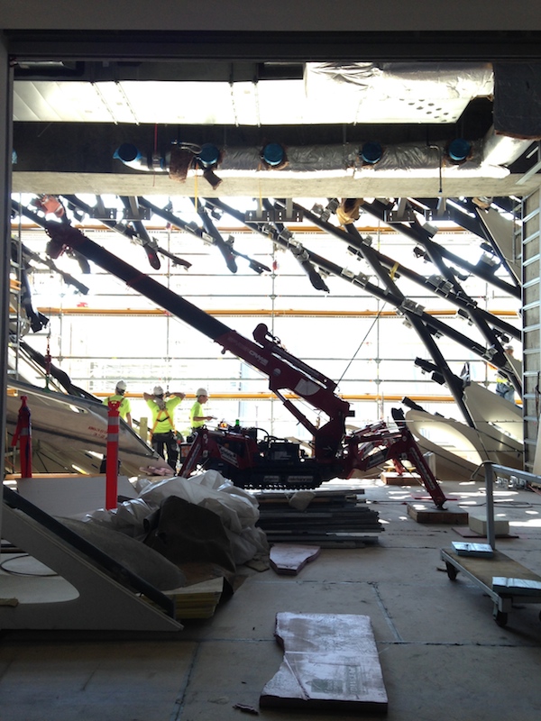
Portfolio | L.A. Rainbow
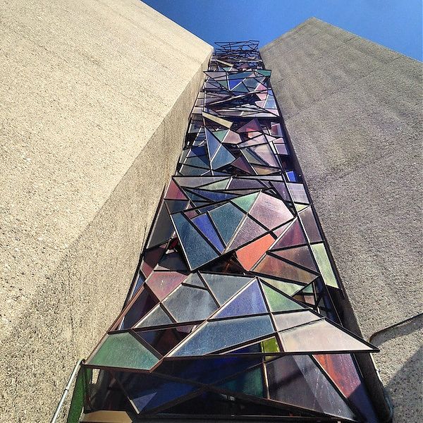
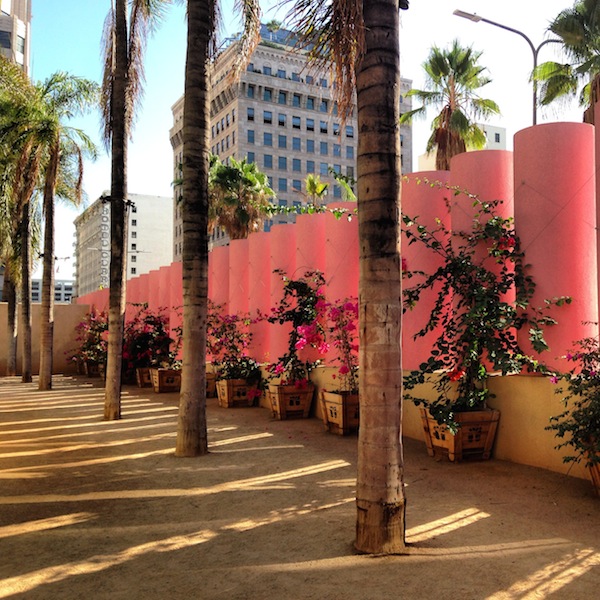
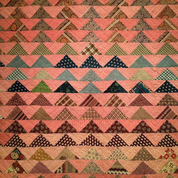

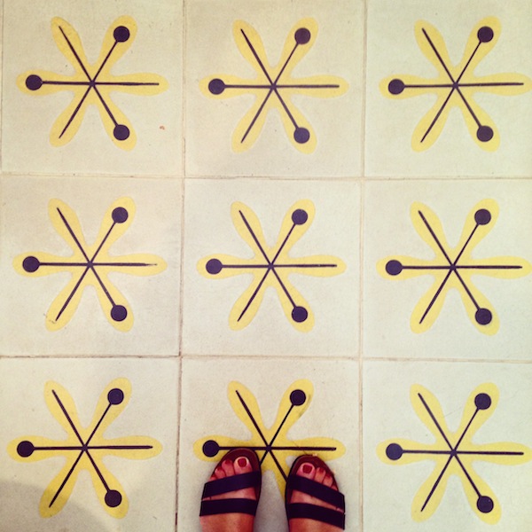
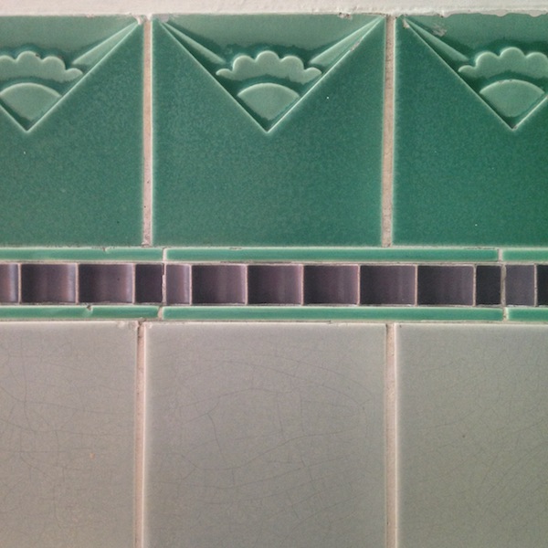

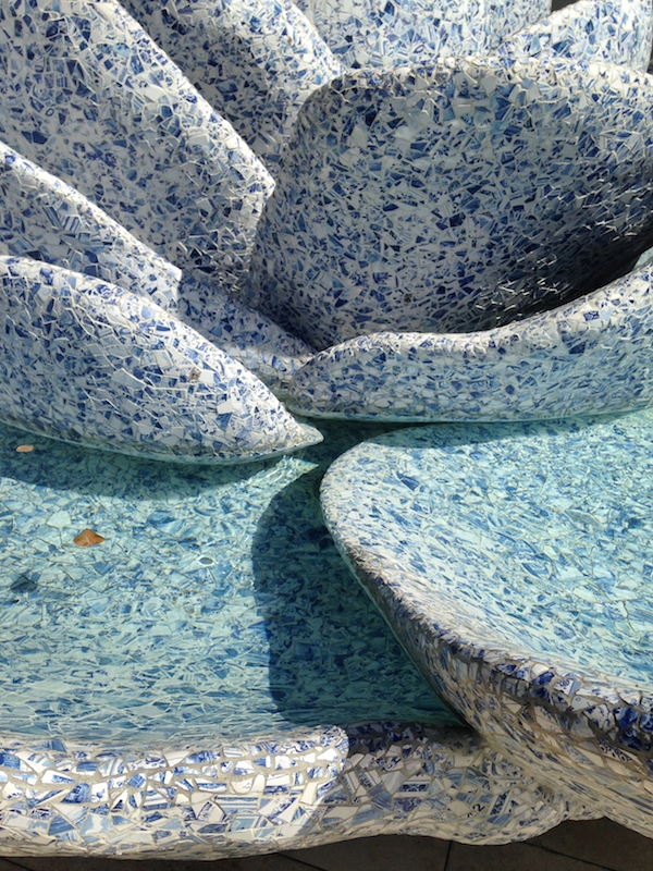
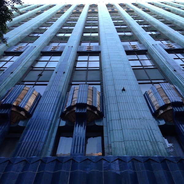
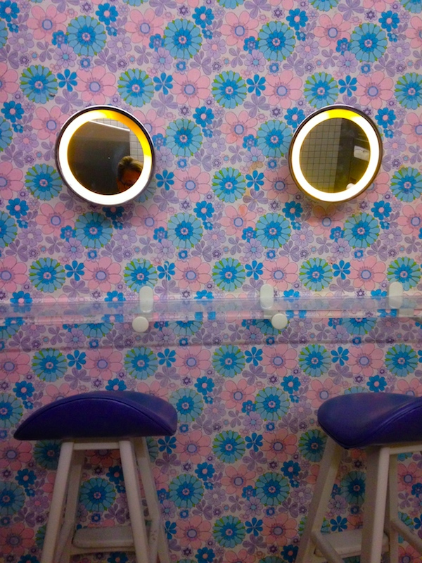
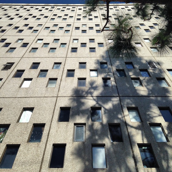
Top to bottom: Claire Falkenstein, St. Basil’s Catholic Church; Ricardo Legorreta, Pershing Square; “Big Quilts in Small Sizes,” LACMA; Jorge Pardo, LACMA Latin American Art galleries; Alvin Lustig, private house; Field Operations, Tongva Park; Art Deco tile, The Wiltern; Moore Ruble Yudell, The Seychelle; Frank Gehry, Disney Delft fountain; Claud Beelman, Eastern Columbia Building; Jim Walrod, The Standard Downtown; Eliot Noyes, IBM Los Angeles (now Otis); Virgil Avenue vernacular.
On X
Follow @LangeAlexandraOn Instagram
Featured articles
CityLab
New York Times
New Angle: Voice
Getting Curious with Jonathan Van Ness