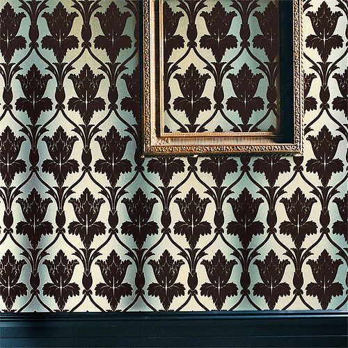
Sherlock's Wallpaper

When I started my first blog in 2009 I called it A Bit Late. At that time, with one-year-old, I felt as if I were always catching up, wanting to join conversations that were already, in media terms, over. Many of those conversations revolved around TV because of said baby. This week I find myself in that position again, having just started watching Sherlock after it won several Emmys. (All three mini-seasons are available to stream on Netflix.) It took me all of five minutes into the first episode to sit up and say, This show is serious about wallpaper.
I knew from experience that a show serious about wallpaper would have serious Tumblrs. It took me a few days but I finally found the definitive collection of Sherlock wallpapers, screen-shotted and identified, by Stepford Geek. I’d say my favorites so far are the floating, sepulchral trees of the abandoned house in “A Study in Pink” and the delicate Chinoiserie panels in the therapists office in the same episode. Bonus points for fandom if you can immediately visualize both. Also of interest: the retro-fabulous textured papers. My first apartment in Brooklyn had early 20th century versions of these in the stair hall, much overpainted but still working as industrially-produced ornament.
After rejoicing in their identification, and the strange obsessive communities once finds online, I had to ask: What are the wallpapers doing? Why wallpaper? My first theory would be that it’s a British thing: from Liberty to Boden, kilts to china, British decorative arts and fashion remain more free with pattern than their American counterparts. Steven Moffat has taken a classic and updated it, with just enough historic references (the deerstalker hat, the nicotine patches), to honor the original. These wallpapers do the same, referring to the drawing rooms of the past but, in their oversize glamour, their crime-scene decay, or their hidden messages (Devil Damask Flock at Irene Adler’s house should serve as a warning) undermining their propriety. Production designer Arwel Wyn Jones is providing subtext.
Second, I began to think of them as skins. Sherlock spends a lot of time in interiors, and people with more knowledge of London than I have can probably read the socio-economic status of those inside from their facades. The wallpapers serve as another kind of facade, demonstrating how individuals want to present themselves. Sherlock “reads” clothing and accessories, but rarely the rooms. That’s for us to do. A particularly illustrative example of this self-presentation occurs in the apartment of the blonde, cute, bereaved fiancee in “The Great Game.” Her walls are covered in Sanderson’s Dandelion Clocks, a bright, graphic, modern pattern (clearly inspired by the textiles of Lucienne Day). Her wallpaper says she is from a different generation, a modern young woman, while still maintaining the production designer’s theme.
Lastly, I suspect Sherlock’s costume came before the wallpaper. How better to set off a main character in black, with ivory skin, than by a riot of pattern. Whether fighting off a swordsman or complaining of boredom (on a jaundiced green leather sofa), Sherlock is the supergraphic over the graphics on the wall. As he should be.
On X
Follow @LangeAlexandraOn Instagram
Featured articles
CityLab
New York Times
New Angle: Voice
Getting Curious with Jonathan Van Ness