Alexander Girard: A Designer's Universe

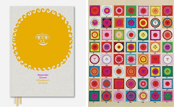
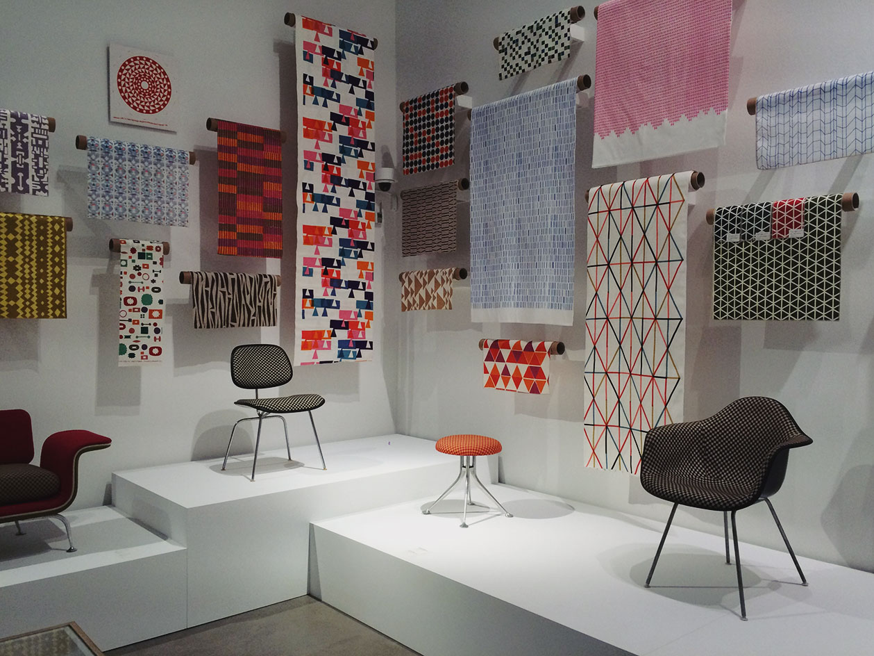
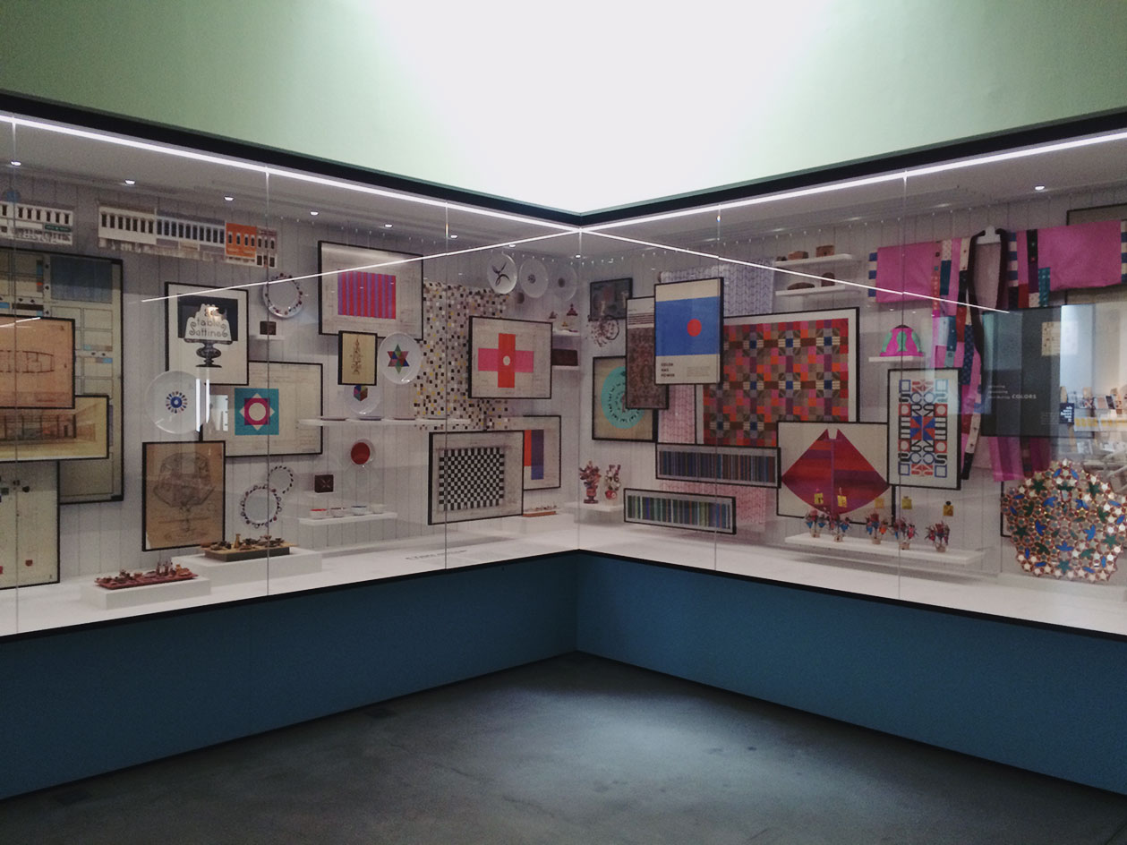
Catalog cover, "A Designer's Universe": Matchbook covers, La Fonda del Sol. Below, views from the exhibition.
On March 12, Vitra Design Museum opened the first comprehensive survey of the work of Alexander Girard, the midcentury architect, designer of textiles, interiors and exhibitions, and collector of folk art. He’s long been an obsession of mine, and I was pleased to be able to contribute to the 500-page catalog (seen above). It’s really a must-buy for anyone who loves this period, with lots of treasures from the Girard archive at Vitra, photographs by Charles Eames and Balthazar Korab, and all the gorgeous textile samples you could desire. My essay is on his work in Columbus, IN, which included urban design and some major home and office interiors. Photos from my research trip are here, and an earlier lecture I gave on Girard’s work is here.
To give you a taste, I’ve posted the introduction to my essay below.


Alexander Girard in Columbus
“Driving with Sandro out Highway 46 West, you have a lot of different signs, different heights, different levels, and it would just drive him crazy. He wanted to organize them. He had such a great sense of order. You would go into his office and everything was neatly arranged. Nothing was out of place.”
Bill Chambers on Alexander Girard
In 1964 Alexander Girard got his chance to organize an American street. Not the unruly automotive landscape of Indiana State Road 46 but the smaller-scale commercial facades of the principal thoroughfare of Columbus, Indiana: Washington Street. In God’s Own Junkyard, published the same year, architect and critic Peter Blake documented “the mess that is man-made America,” assigning equal blame to the “well organized and well financed” billboard industry and to “little people . . . tradesmen and shopkeepers trying to make a modest living . . . whose eyes have lost the art of seeing.” In Blake’s chapter on townscape, there is an image of a commercial thoroughfare in Salt Lake City as a mess of conflicting signs: Florsheim shoes, the Paramount theater, the Mayflower Café with a neon sailing ship and a giant vertical UTAH.
Washington Street never reached this level of cacophony but none the less, in March 1961, S. E. Lauther, president of the Irwin Union Trust Company (housed in Eero Saarinen & Associates’ 1954 building4), wrote to Girard about “the possibility of cleaning up and beautifying the fronts of the stores and other business houses up and down Washington Street.” After a positive response from Girard, Lauther and the other members of the Downtown Development Agency invited Girard to come to Columbus on May 5, 1961.
Mr. Girard pointed out that in our effort to be “different” we, as merchants, are growing toward a rather horrible degree of “uniformity”. This is true even though the signs are of different shape, sizes, color, light intensity, etc. We have pretty much arrived at a “jungle” wherein one sees everything at the same time he is seeing a blur of nothing.
Girard took the members of the Downtown Development Agency on a walking tour of the “rogue’s gallery” up and down Washington Street, pointing out such visually problematic decisions as buildings painted two different colors, signs too large for their structures, cheap-looking materials and stores remodeled without respect for their neighbors. At a meeting the next day, Girard suggested that Washington Street needed restoration and “cleaning up”, and that he might be able to create a demonstration of “before and after” by painting or drawing on top of overexposed photographs of the existing storefronts to save the cost of building a model. Lauther added, “He seemed to favor doing one city block on one side and letting it serve as a guide, as well as an inspiration in causing the community to go further.”
The process Lauther outlined in his memorandum proved to be prescient, though it took until 1965 for the first model block, on the east side of Washington Street between Fifth and Sixth Streets, to be executed. In the interim, Girard took scale photographs of all of the storefronts in the central business district.8 Girard and his staff painted each building a combination of the 26 colors he selected for the project, and then mounted these paintings on Masonite boards and shipped them to Columbus, where they were exhibited on Washington Street. A clipping from the Columbus Republican shows Girard and his associate Karl Tani overlooking the storefront
display like smiling design dictators. The panels have been set up on wood stands on a large tabletop to simulate the continuous street front along individual blocks. (Eight of the twenty original panels are now on permanent display at Columbus City Hall; two are in the Girard Archive at the Vitra Design Museum).
In a pamphlet published to commemorate the renovation of 80 percent of the storefronts to Girard’s specifications, the anonymous author wrote:
One of the startling aspects of the proposal and one which was of immediate appeal to young people in the community was Girard’s use of bright accent colors for decorative details and windows, the most popular being the bright orange bay window near Sixth Street on the east side of Washington Street.
That burnt-orange window made it onto the December 1965 cover of Architectural Forum, in a Balthazar Korab image that shows the combination of white, orange, pea soup green and buff that Girard chose for 237 Washington Street. Although Girard had a list of 26 colors, certain hues predominate on the maquettes, including orange, green, white and buff, along with a sky-blue. For each building, Girard and his associates carefully considered its period details, using white to outline elaborate window frames on a brick building, blue to create a shadow below the lacy lines of a white cornice, and combinations of earth tones to modulate the low-relief ornament on a rare stucco facade. The scheme carefully modulated intense, Victorian gingerbread moments with more restful fields of color or tone-on-tone combinations, limiting the color palette and sign size to a narrow range. Other unifying touches included a common awning with indirect lighting and signs flush with the building wall. Color-coded maps show that Girard arranged the dominant color of each facade so that no two
storefronts of the same color faced each other. His suggested sign designs emphasize the nature of the business, prioritizing information such as “Insurance,” or “Schiff’s Shoes.”
He treated the whole town as a composition to be organized, a flat surface over which complex and colorful elements might be gridded and arranged in individual white boxes like his textiles for Herman Miller or, closer by, his handling of the storage wall in the J. Irwin and Xenia Miller House. The way that Bill Chambers connected Girard’s dismay over the American commercial landscape to the organization of Girard’s own office is entirely apposite: Girard would have rearranged and touched up the world, given the chance.
On X
Follow @LangeAlexandraOn Instagram
Featured articles
CityLab
New York Times
New Angle: Voice
Getting Curious with Jonathan Van Ness